
Unified Platform Redesign (NDA)
Under NDA. In compliance with project confidentiality, proprietary branding, specific details, and raw metrics have been obscured. This case study highlights the methodologies, user flows, and design systems used during the project. Reach out to discuss further details privately.

OVERVIEW
This project involved an actively developed educational technology ecosystem serving students, educators, and administrators. Unlike my solo projects, I integrated into an established cross-functional team utilizing a mature, AI-assisted development workflow.
As the UX Engineer covering the full spectrum of user types, my objective was to unify a fragmented visual language and streamline core workflows across multiple connected portals. Over two months, I shipped responsive navigation systems, complex data-visualization tools for educators, and streamlined communication flows for students, all while adhering to strict codebase guardrails.
TIMELINE
April 2026 to August 2026
MY ROLE
UX Engineer
THE TEAM
UX Engineer, within a cross-functional team of engineers and PMs
TOOLS USED
Figma, Claude Code
Quick Wins
Based on informal teacher feedback, assignment creation time dropped meaningfully once teachers could generate a full draft instead of writing one from scratch.
Early usage patterns after the redesign showed engagement improving, particularly around students returning to check progress rather than just submitting and leaving.
Early signal after the parent portal launched: several parents who explored it went on to browse the shop, start free trials, and buy supplemental course packs, turning a passive email recipient into an active customer.
The Problem
Because the platform had grown rapidly over time, the user experience had drifted across different areas of the product.
- Fragmented Navigation: Different portals utilized separate navigation patterns, making the ecosystem feel disjointed as users moved between dashboards and active tasks.
- Data Visibility Gaps: Educators lacked a centralized, high-level view of cohort progress, requiring them to manually dig through individual records to track performance.
- Inconsistent Design Language: Shared components like sidebars, toggles, and admin panels had diverged in style across the platform.
- Mobile Debt: Legacy layouts were designed primarily for desktop, resulting in compromised touch targets and awkward grids on smaller devices.
Business Goals
Beyond the UX problems, this rebuild was tied to concrete business priorities: reduce the time teachers spend on repetitive admin work so retention improves, lower the friction for newer roles like parents so platform adoption grows beyond the core student and teacher base, and replace a hard coded foundation that was becoming too costly to keep patching, so future features could ship faster.
Working Inside an AI-Assisted Team
A Shared Figma-to-Code Contract
The team operates on a strict Figma-to-code workflow where semantic tokens defined as variables map directly to Tailwind utilities. I ensured every design shipped with exact node URLs, responsive variants, and comprehensively defined states (hover, focus, disabled, loading, empty, error) before it entered development.
Checkpoint-Driven Development
Rather than relying on massive handoffs, work moved through rapid, AI-assisted validation checkpoints. A significant portion of my frontend commits were co-authored with Claude Code, seamlessly integrating into the team's continuous review and testing pipeline. Joining this environment required a different discipline: designing, building, and regression-testing inside technical guardrails I hadn't set myself.
Continuous User Validation
Over my years at MeeOpp, testing key flows directly with students, educators, and administrators made it clear that the old platform's foundation, full of hard coded logic and difficult to scale, needed a rebuild from scratch rather than another patch. Parents were a newer addition to that testing — previously they had no real platform at all, just an email summary of their child's performance, so validating their first real dashboard experience was its own effort.
Figma
Claude Code
> Reading Figma frame Teacher/GenerateAssignment/Step2
> Matching design tokens → Tailwind utilities
> Scaffolding states: default, hover, focus, error
> Component ready for review ✓
Design System & Technical Architecture
One Shell for Every Flow
To resolve the disjointed navigation, engineers on the team built a reusable "Shell" component, and I focused on polishing the UX and UI, standardizing how the sidebar and topbar looked and behaved. Rolling this out across the student facing portals replaced multiple separate implementations with a single, unified navigation system, creating a continuous experience across the entire ecosystem.
Unifying a Drifted Visual Language
I executed a comprehensive platform-wide cleanup to eliminate design drift. I standardized button sizing across all breakpoints, rebuilt the avatar system into a single robust component, and synchronized admin panels onto a shared visual foundation.
Responsive, Mobile-First Refactoring
Layouts that previously only functioned at desktop widths received a proper responsive overhaul. I engineered fluid grids that reflow based on viewport size, sidebars that collapse into a slide out menu on mobile, and made sure touch targets were sized for real use.
A Design System That Polices Itself
Built the accessibility and responsiveness checks in the design system's automated testing pipeline: every change is swept in a real browser at phone, tablet, and laptop widths and checked for text readability, tap target sizing, and layout regressions, on both the component and the real product pages that use it. A change can't merge until it passes, so responsive and accessibility compliance is enforced automatically instead of relying on someone to catch it by hand.
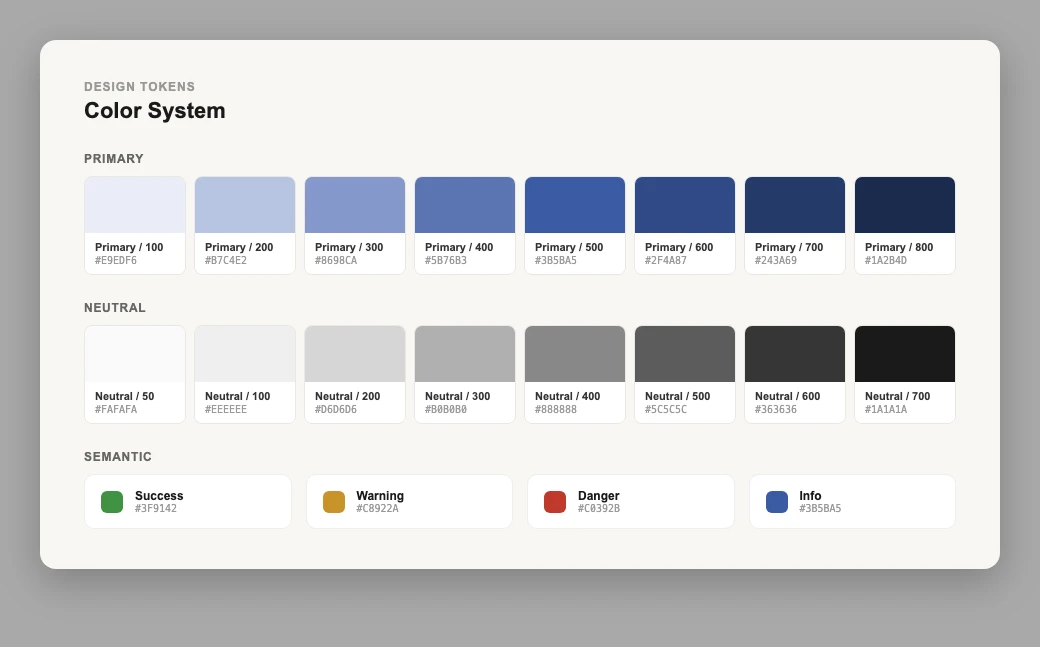
Color tokens — primary, neutral, and semantic scales
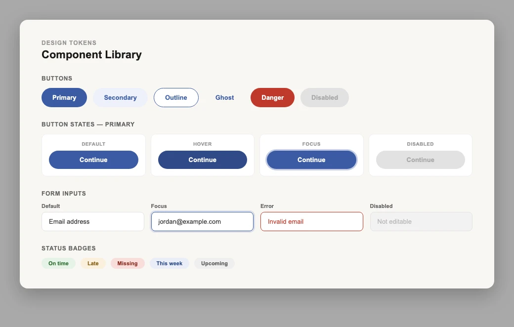
Component library — buttons, states, inputs, and status badges
Outcome
Research
Rather than redesigning the homepage from assumptions, I ran a series of generative research sessions with students: each one built their own "ideal homepage" from scratch in a shared whiteboard, with no existing design shown to them first. After a handful of these sessions, I synthesized the recurring patterns across participants into a single framework for prioritizing features, separating what students consistently asked for from what only one or two mentioned. That framework directly shaped what made it into the final Unified Navigation.
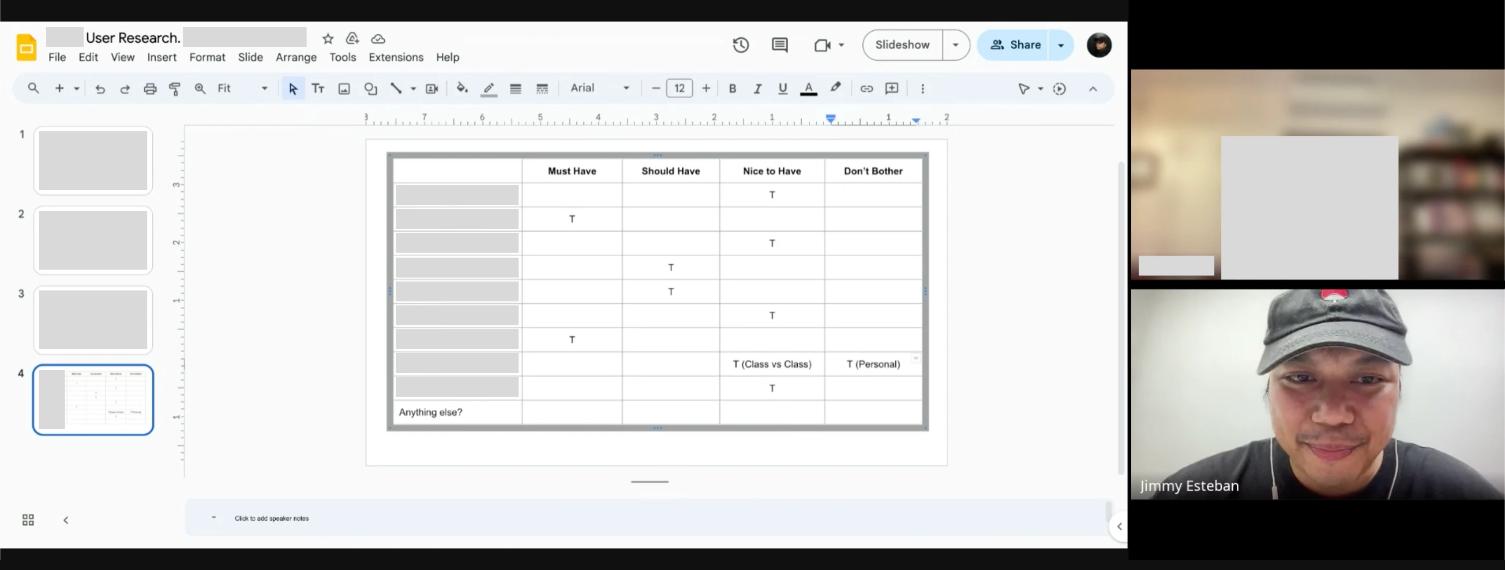
Synthesizing feature priorities across student research sessions
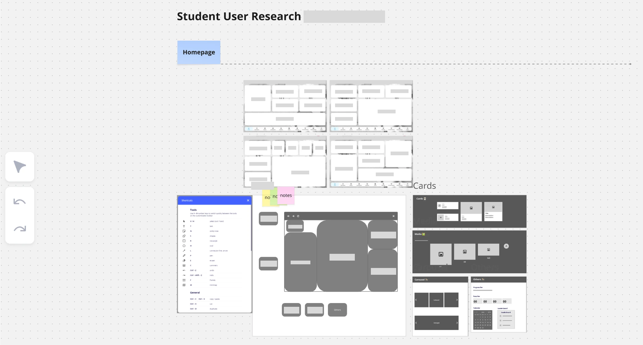
One student's "ideal homepage" wireframe exploration, with different card options
Shipped
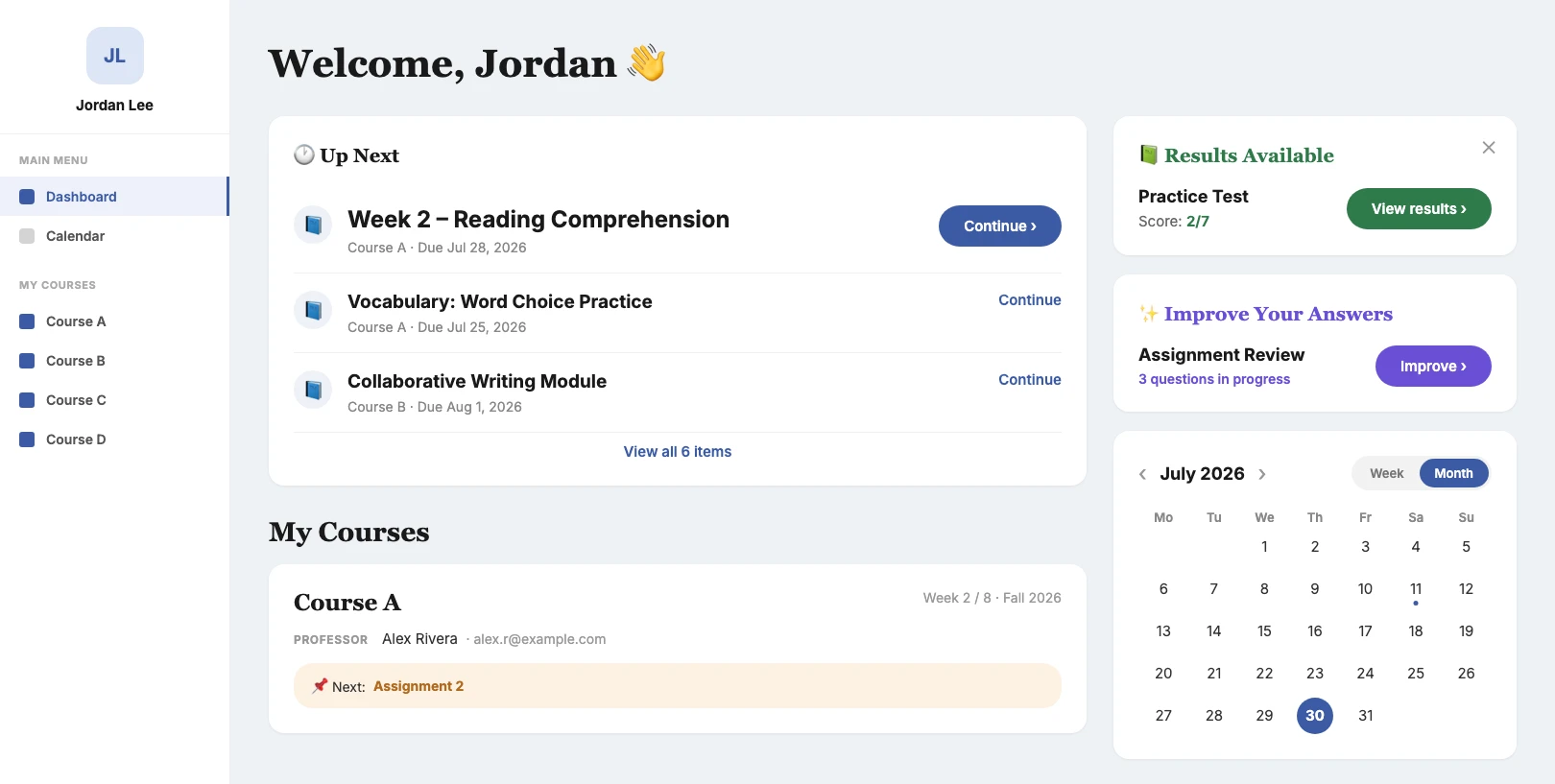
Unified Navigation
A single, scalable navigation shell replaced multiple fragmented implementations across student dashboards and course views, creating a continuous, seamless experience.
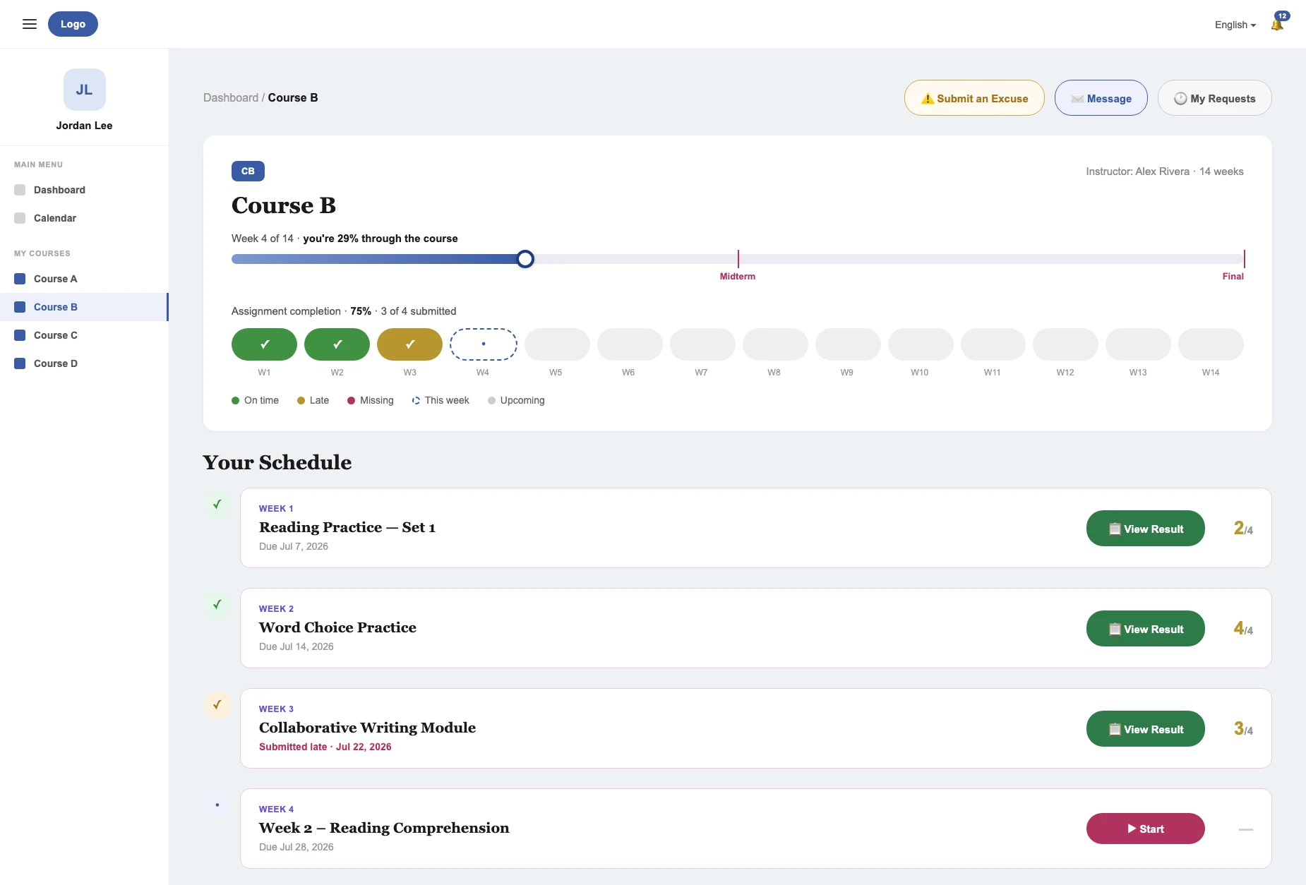
Course Timeline
A consistent, responsive view of current progress and upcoming tasks, integrating per-week completion markers directly into the new unified navigation system.
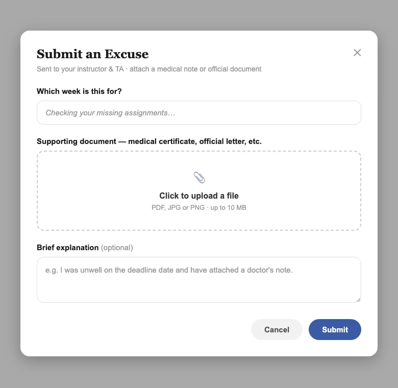
Requests & Messaging
An end-to-end communication flow featuring structured file attachments, multi-recipient selection, and a persisted request history so students can confidently track their inquiries.
Research
Teachers are stretched thin outside the classroom too, a lot of grading and progress-checking happens on their own time, squeezed between everything else in a day. That constraint shaped the dashboard and roster views: rather than digging through individual student records to figure out who's falling behind, a teacher can see cohort-wide status and clear next steps the moment they open the app.
Teachers also didn't share one workflow for organizing course materials. Some wanted to prepare an entire term's worth of readings upfront and sort them into weeks later; others preferred uploading materials incrementally, week by week, as each one approached. Rather than forcing a single pattern, I designed the upload experience, built together with Claude Code, to support both: teachers can drop files into a shared materials library and assign them to a week whenever they're ready, or upload directly into a specific week as they go. Materials can also be reassigned between weeks afterward without re-uploading, so an early organizational choice is never a dead end. Underneath that flexibility sits a fair amount of real complexity: per-file upload progress, deduplication so the same file isn't stored twice, and a background pipeline that feeds uploaded materials into the AI system used to generate assignments.
Grading was another consistent time sink — teachers don't have the bandwidth to write personalized feedback for every student on every assignment. That's where the system steps in: it generates draft feedback per student, and the teacher's role shifts from writing it from scratch to reviewing and adjusting what's already there.
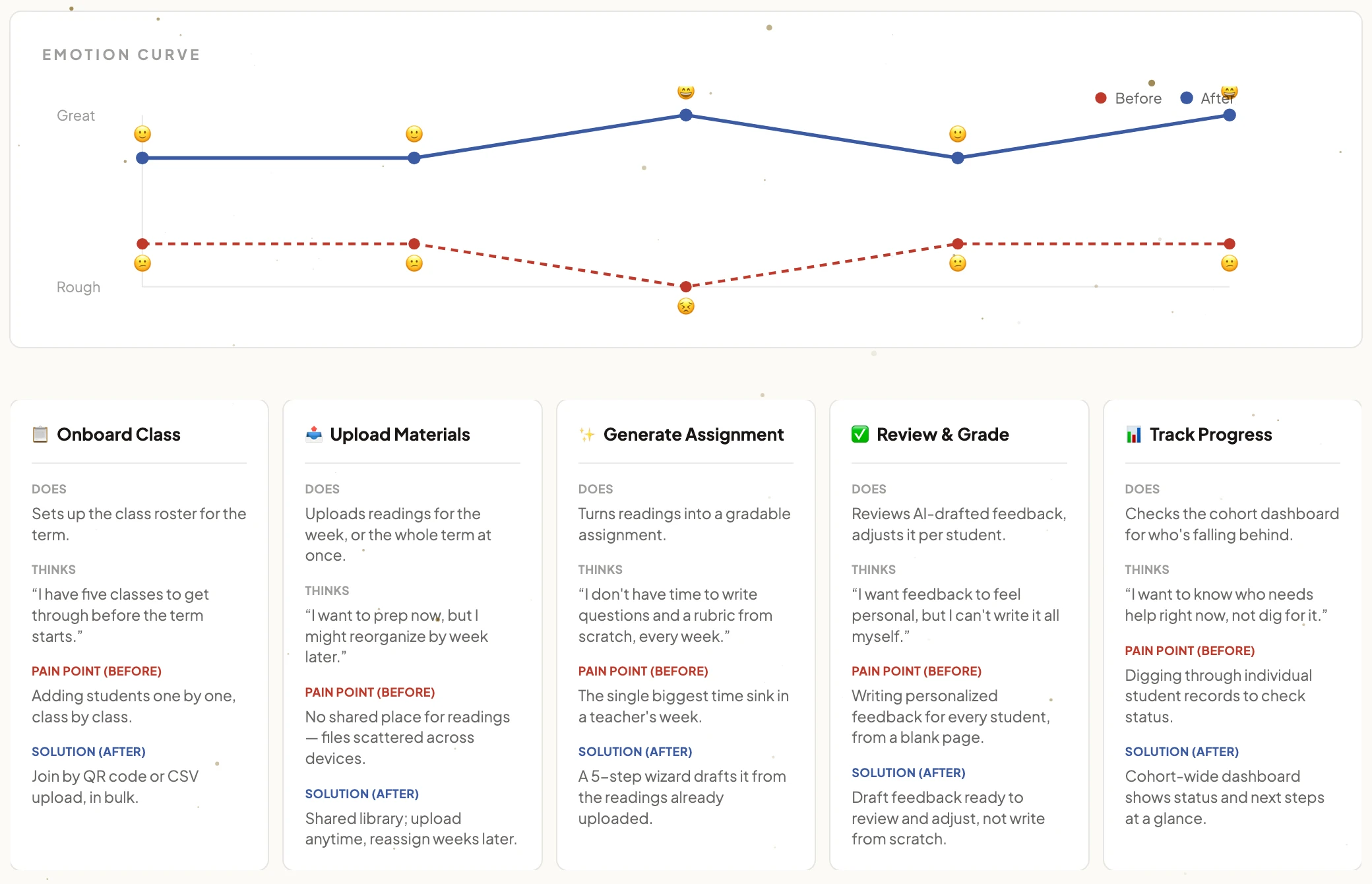
Mapping how a teacher feels across a week, before and after the redesign, not just what the screens do
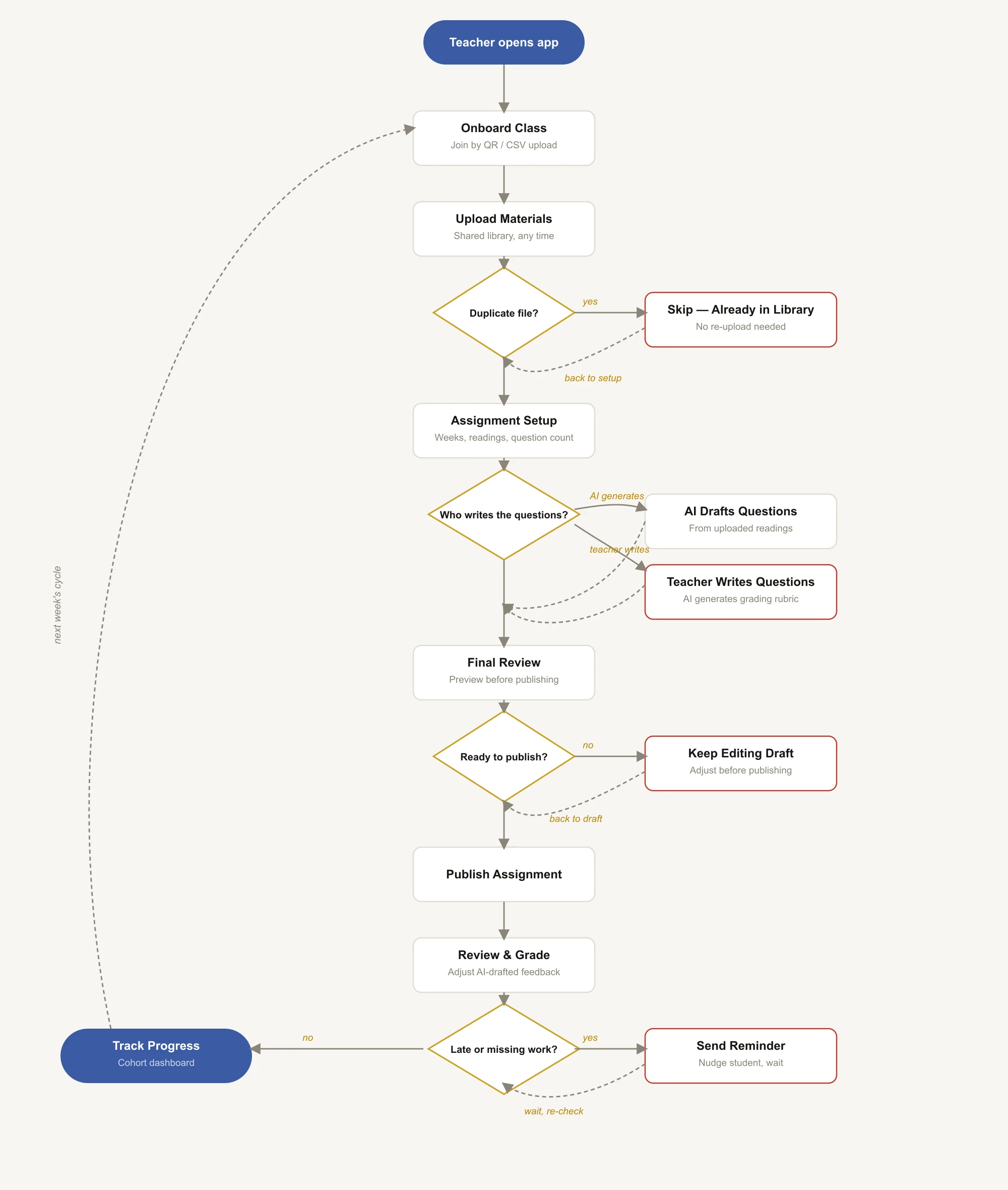
The full weekly flow including edge cases: duplicate files, AI-vs-manual questions, drafts sent back for edits, and late submissions
Shipped
Cohort Progress
Real-time enrollment and status overviews, allowing educators to instantly identify who is falling behind without needing to open individual student records.
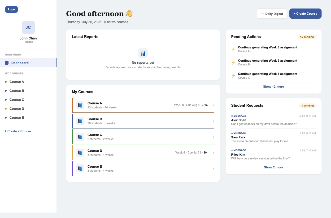
Roster & Progress Tracking
A single view for rostering a class and tracking it afterward: joining by QR code or CSV upload, then a sortable per-week score table across the whole cohort. Drag-to-reorder and bulk actions cut down the manual work of managing rosters and onboarding a new class.

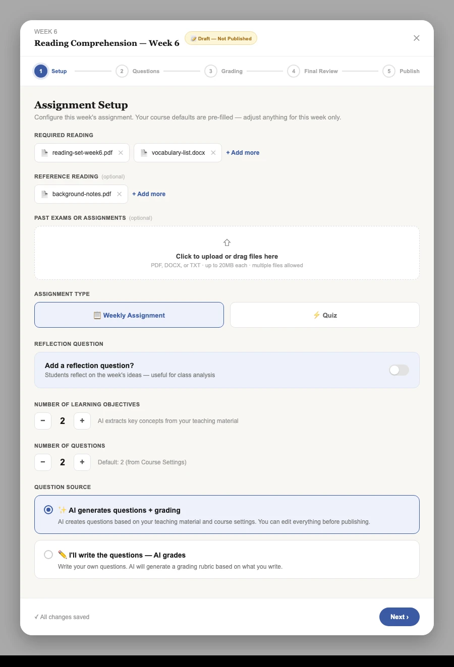
Generate Assignment
A five step wizard (Setup, Questions, Grading, Final Review, Publish) turns uploaded reading material into a fully drafted, gradable assignment a teacher only has to review, not write from scratch.
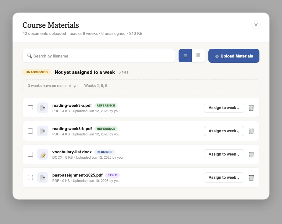
Course Materials
A shared library for uploaded readings, with both list and grid views and a queue for files not yet sorted into a week. Materials can be uploaded all at once or incrementally, and reassigned between weeks later without re-uploading.
Research
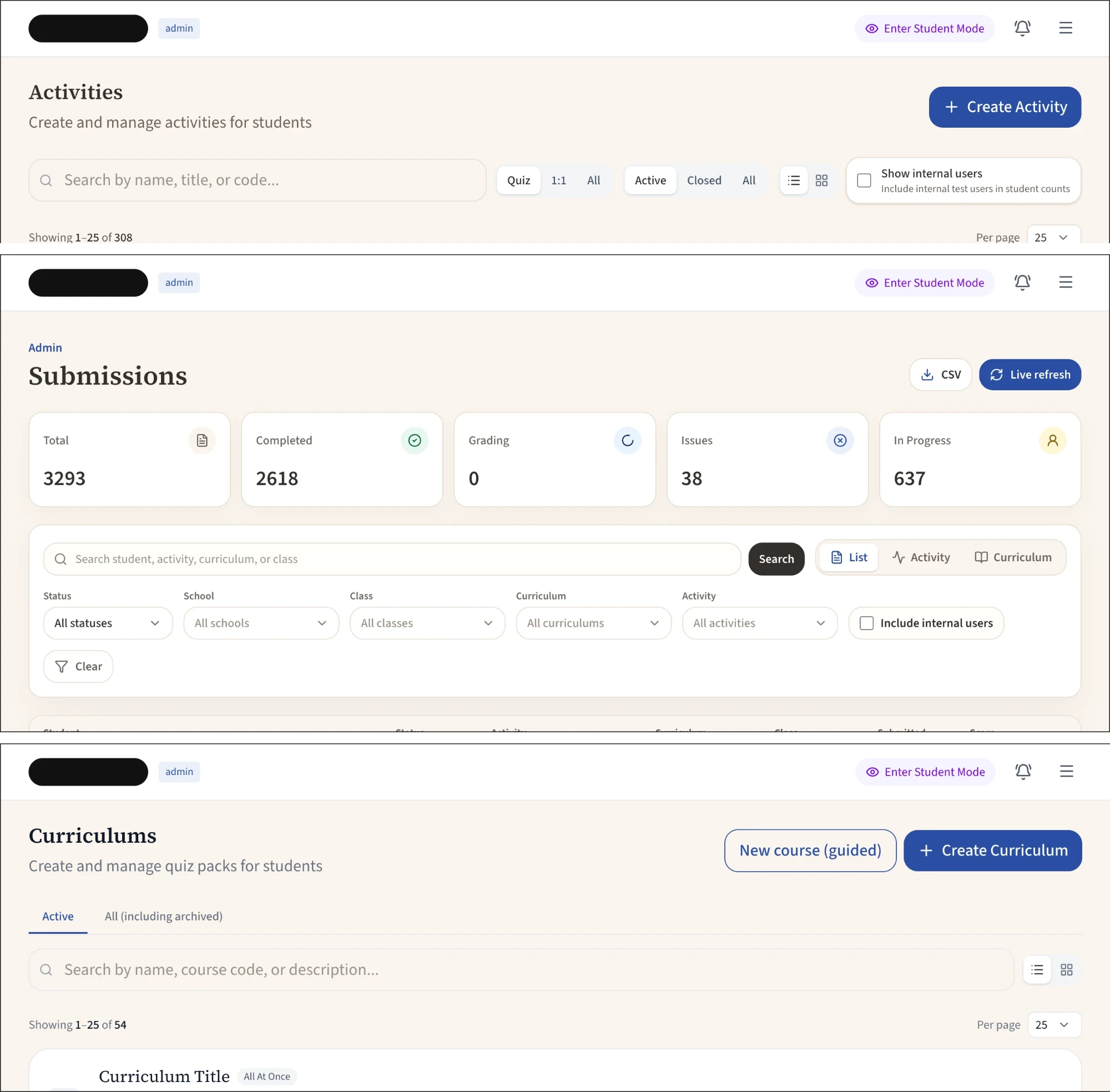
Admin feedback made clear the different panels felt inconsistent to work in day to day, along with requests for both a grid and list view — some admins preferred a scannable table, others wanted a card-based view — and for the experience to work properly on mobile, not just desktop. That fed directly into a layout consistency pass across admin panels, the grid/list toggle on the class management screens, and a full responsive pass across the admin experience.
Shipped
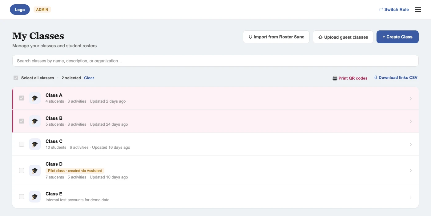
Bulk Class Management
Admins can now select multiple classes at once to print QR codes or export join links in bulk, instead of repeating the action one class at a time.
Admin Visual Consistency Pass
A cleanup across every admin screen: a single beige background standard, square view toggles, a unified button system, and a redrawn loader mark, so panels that had drifted apart over time read as one product again.
Research
Since parents were a newer part of the platform, I ran individual interviews rather than assuming their needs from the student and teacher research. One clear theme: parents currently only get email digests of their child's assignments and performance, and those emails often felt like noise rather than signal, so they wanted updates reserved for genuinely important moments, not routine ones. They also wanted the same level of detail they're used to from a physical report card: specific subject areas where their child needs support, not just an overall score, along with a sense of where their child stands relative to their class and year. That shaped a clear job to be done: when a parent notices their child's performance dropping, they want to know exactly what action to take so they can step in early.
Finding
Email Fatigue
What Parents Said
“Emails can get spammy, I'd only want to be notified about what really matters.”
Design Response
In ProgressDesigning configurable notification controls that reserve alerts for high-importance updates, replacing routine batch email summaries.
Finding
Demand for Granular Progress
What Parents Said
“The report card she gets is really detailed, I'd want that same level of detail in the app.”
Design Response
This finding fed directly into a diagnostic breakdown view, built by another engineer on the team, showing specific areas of strength rather than a single overall score.
Finding
Homework Handoff Friction
What Parents Said
“Right now, I sit with her, photograph her work, and send it to the tutor myself.”
Design Response
In ProgressDesigning an in-app photo upload flow to remove that manual handoff step.
Shipped
Shipping — coming soon.
Reflection
This project asked for something different from my other case studies: designing and building well inside a system I didn't create, alongside a team and an AI-assisted workflow that were already moving before I joined. That meant listening for where existing patterns made sense before reaching for a rebuild, and picking my battles on where genuine unification was worth the churn. The internal-only tools the pedagogy and engineering teams use daily, like the content lab, scaffold logs, and essay review workspace, were deliberately left on their older styling. They're rebuilt and reshaped constantly as those teams iterate, so polishing them would have been effort that went stale within weeks, and it mattered more to put that time into the surfaces students, teachers, and parents actually touch.