
OVERVIEW
Transigo is a FinTech firm that provides a "Buy Now, Pay Later" solution tailored for B2B marketplaces. I was brought on for a rapid two-week sprint to overhaul their customer-facing application UI and clean up their complex internal data dashboards.
TIMELINE
August 2022 (2 weeks)
MY ROLE
UI Designer
THE TEAM
Solo designer collaborating closely with 1 Developer
TOOLS USED
Figma, SendGrid
Closing the Trust Gap
When I first audited the live application form, there was a complete visual disconnect between the form itself and Transigo's official website. In FinTech, first impressions are everything. If a business is going to hand over sensitive financial data, the platform needs to look perfectly secure and professional.
I completely redesigned the application flow, strictly applying Transigo's official brand guidelines, typography, and color palette so that users felt a continuous, trustworthy experience from the marketing site all the way through to submission.
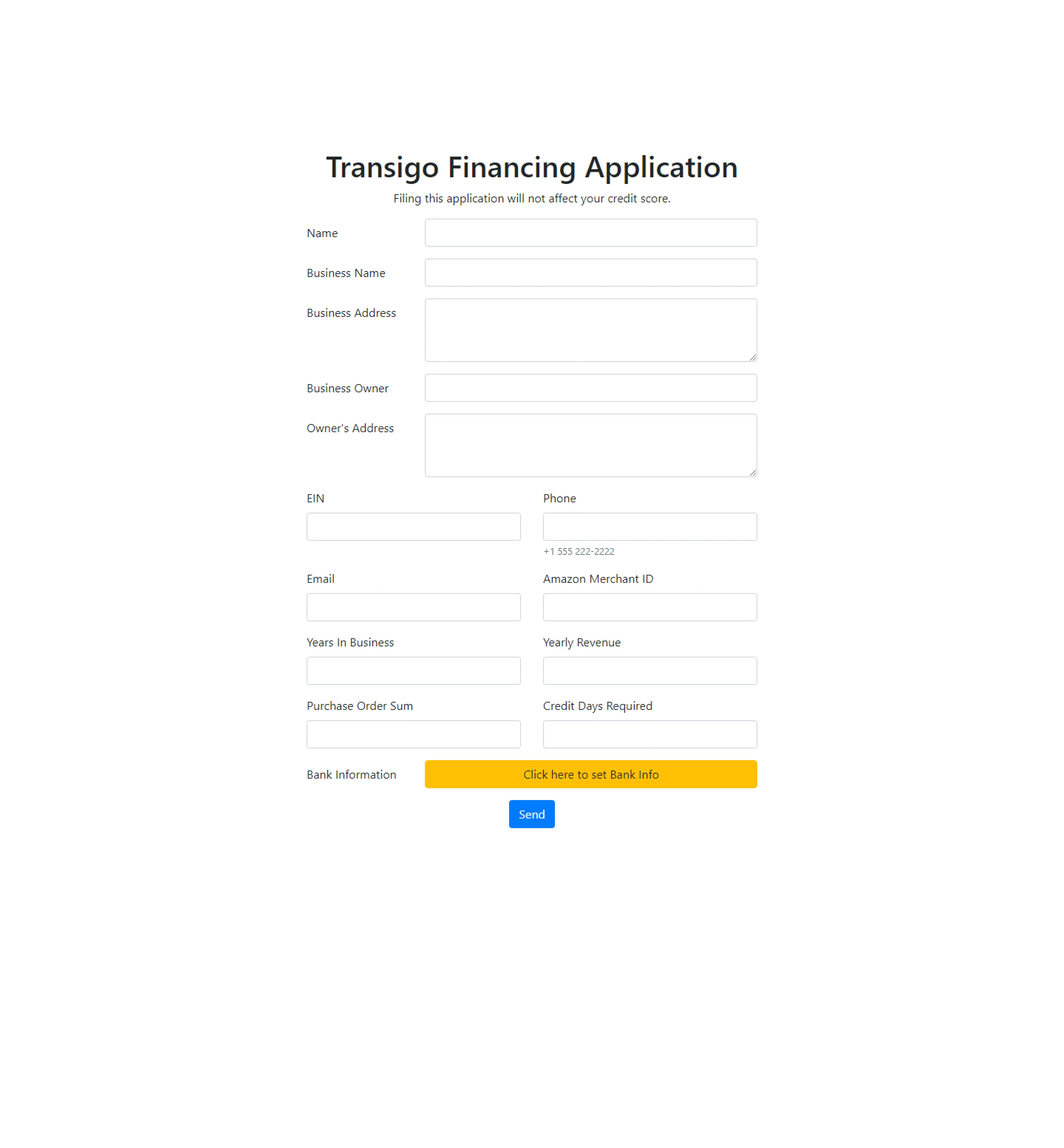
Form (Old)
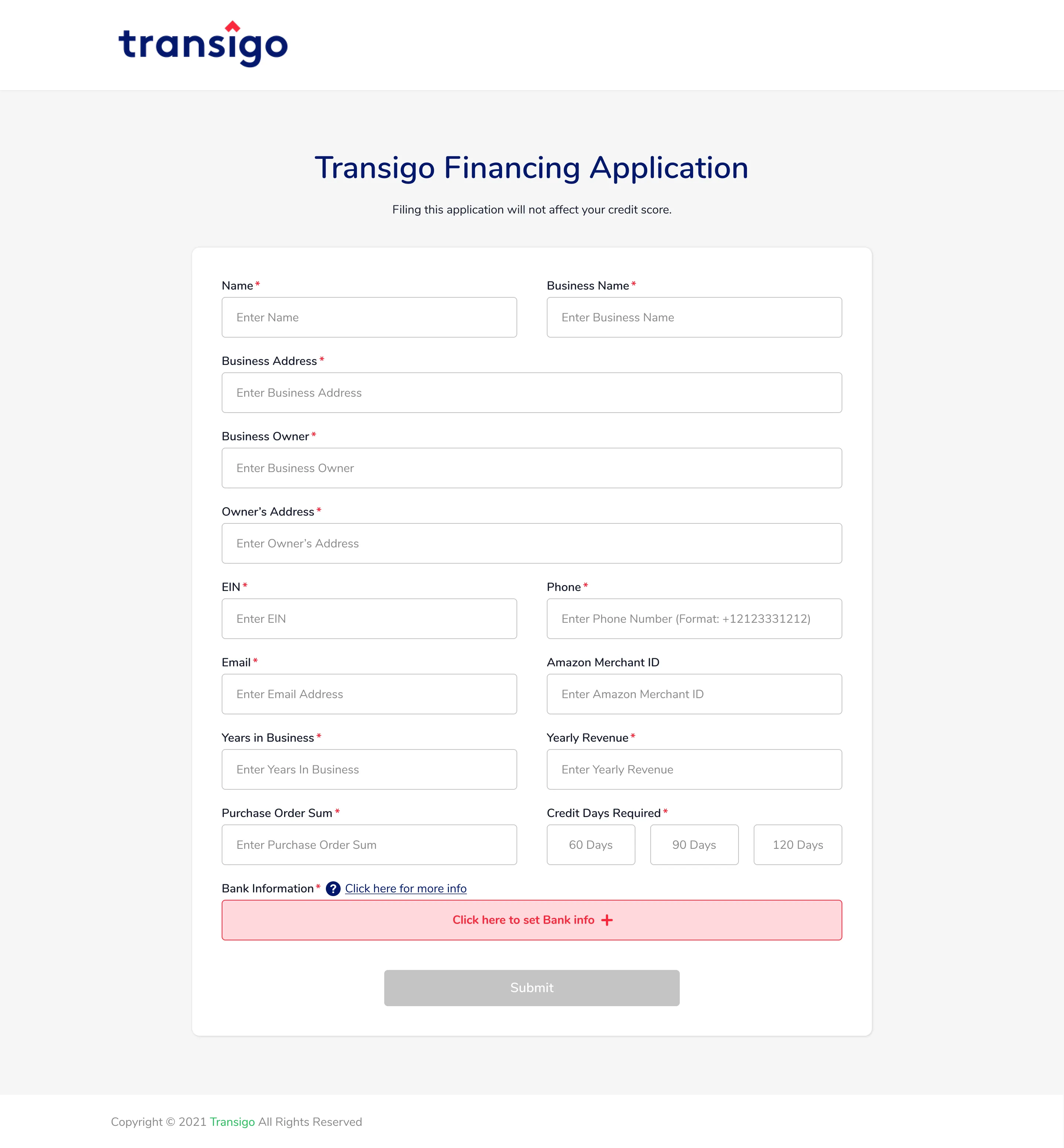
Form (New)
Taming the Data Dashboard
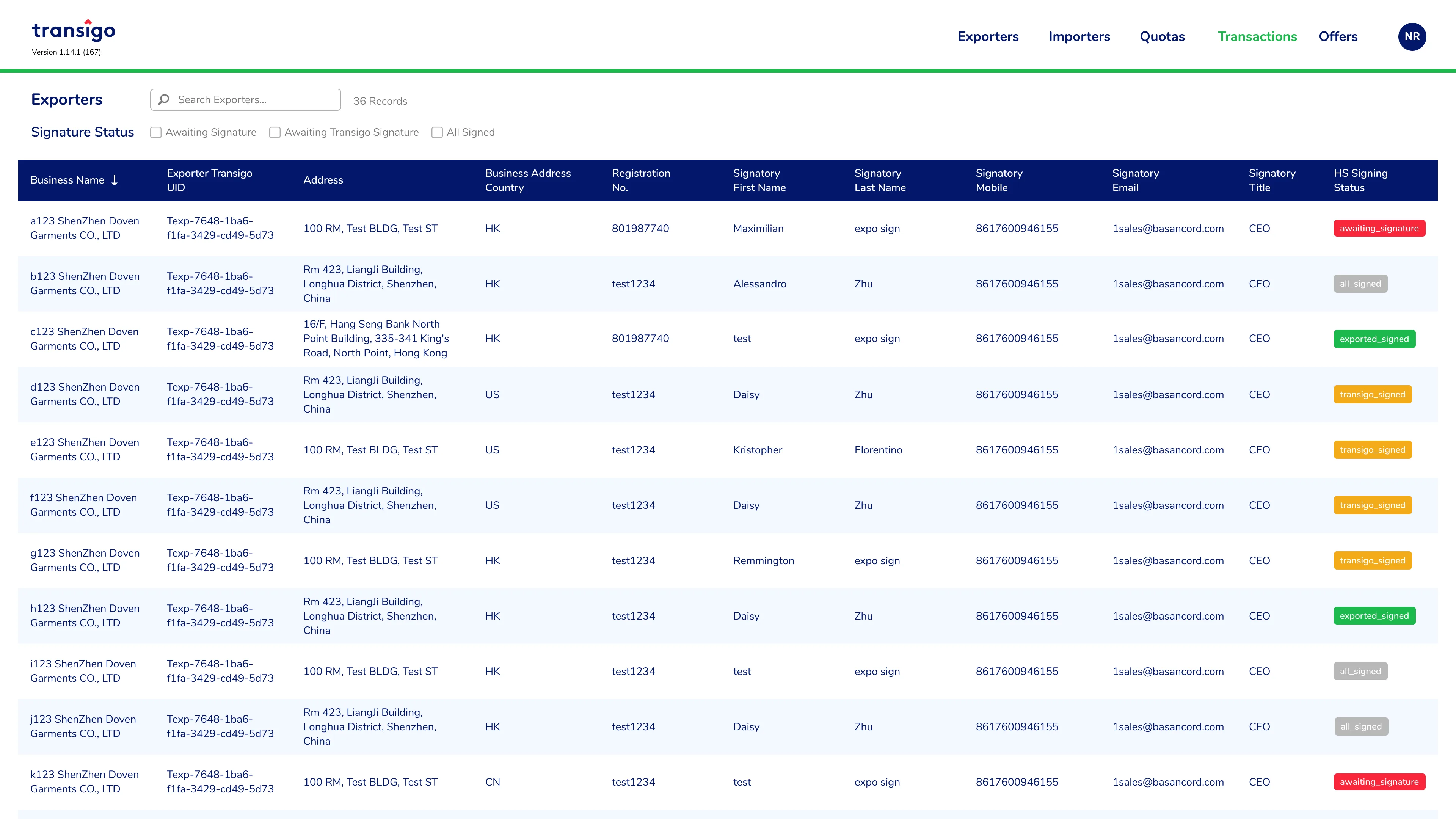
The internal desktop app was suffering from major data density issues. The original tables lacked clear branding, had massive spacing inconsistencies, and forced the user to endlessly scroll horizontally just to read a single row of data.
To optimize the viewport, I heavily refined the table architecture. I combined highly related data points into single columns, adjusted the typographic scale for better legibility, and implemented strict width restrictions for each column to drastically reduce the horizontal footprint.
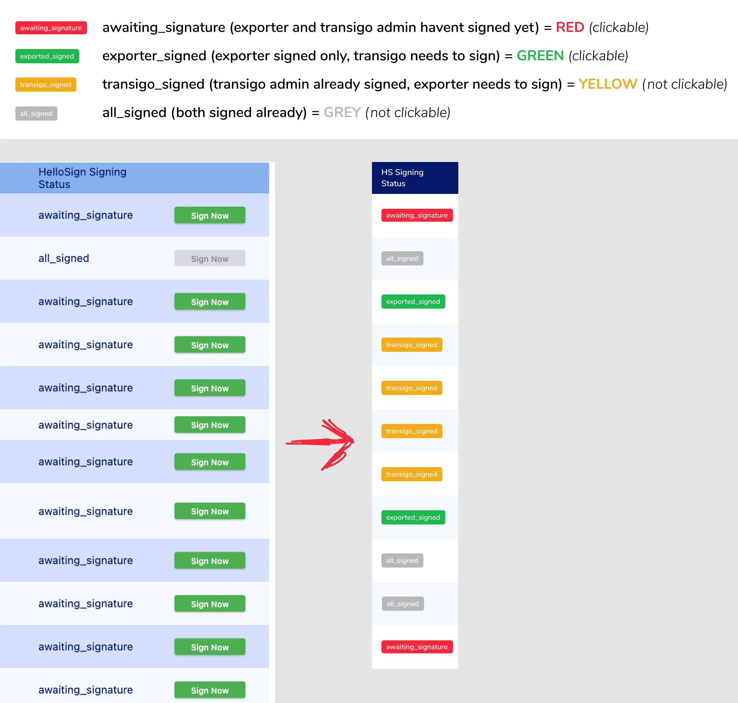
clickables
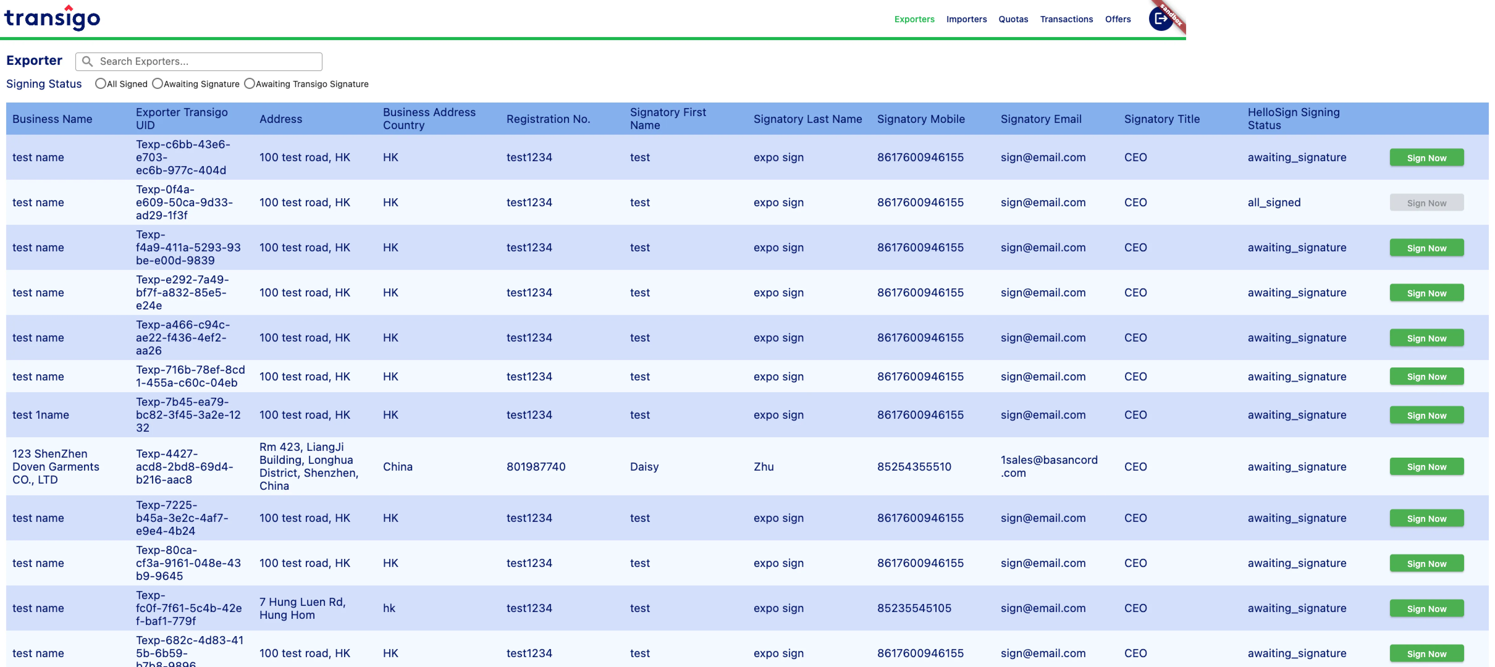
Exporters (Old)
Exporters (New)
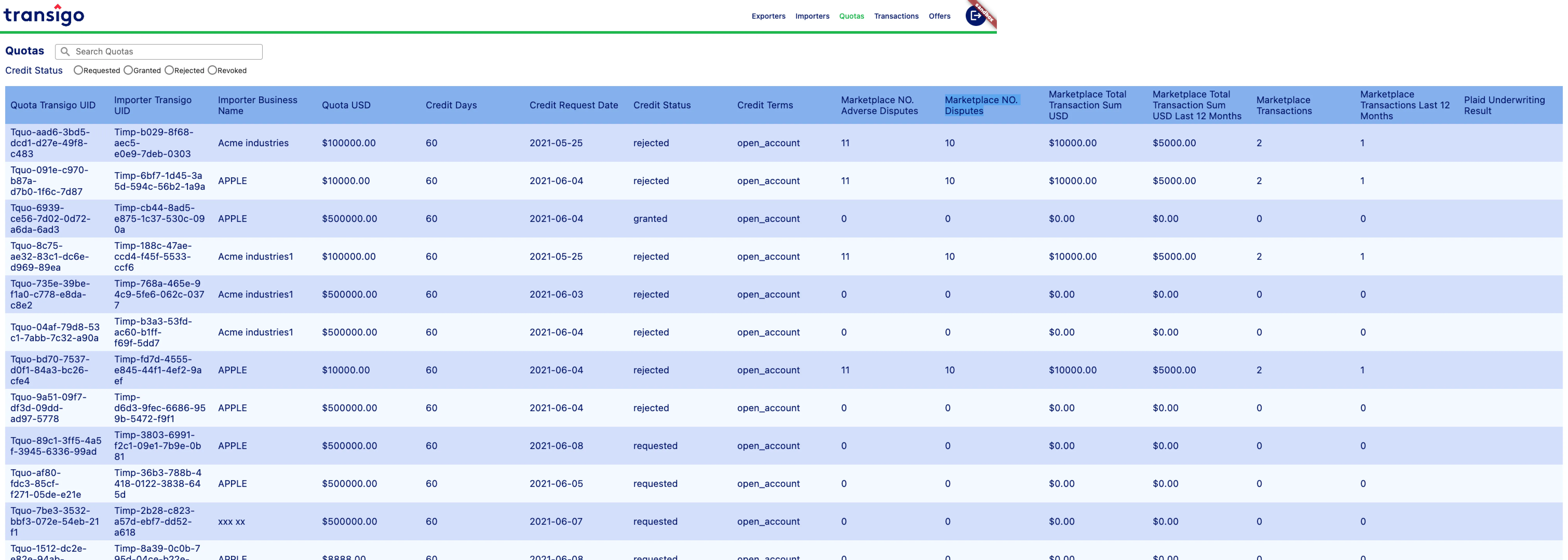
Quotas (Old)
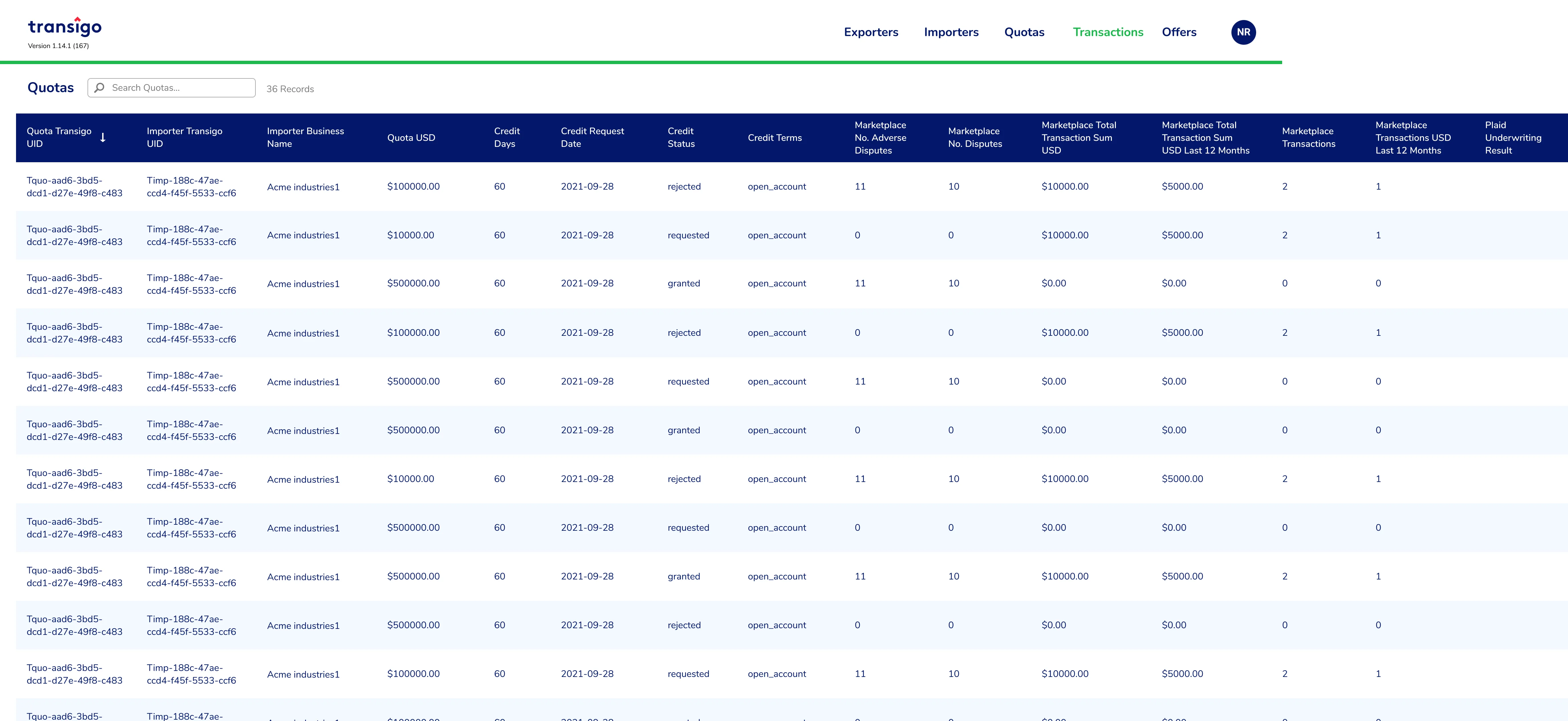
Quotas (New)
Designing for the User's Mental Model
My initial UX instinct was to eliminate horizontal scrolling entirely. I proposed modern data-table patterns like expandable rows for deep-dive details, or toggles to let users turn specific columns on and off.
However, during user discussions, I learned that our primary stakeholder had spent decades managing data in tools like Excel and Access. To him, horizontal scrolling wasn't a usability flaw; it was exactly how his brain expected to navigate dense financial data.
It was a great lesson in pragmatic design. Sometimes, the most successful UX decision isn't forcing the newest, sleekest design pattern onto a user, but rather respecting their established mental model and designing the best possible version of what they are already comfortable with.