
OVERVIEW
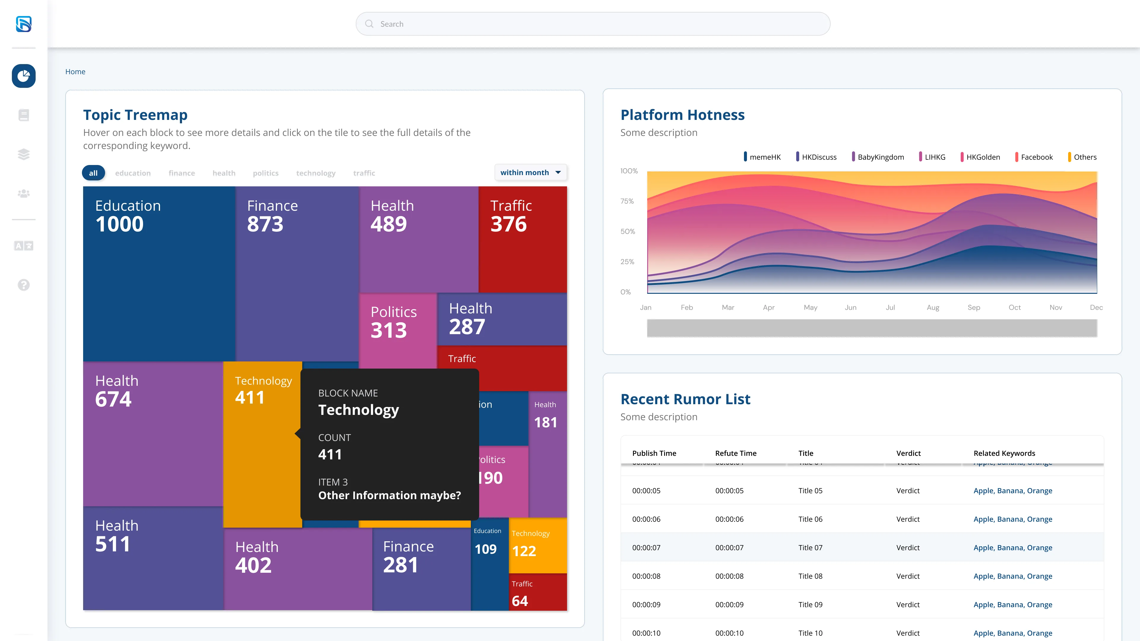
Datago partnered with HKBU to build an interactive, keyword-driven fact-checking dashboard. While the core requirements were already mapped out by the project manager and data scientists, my job was to take those raw data constraints—originally handed to me as basic PowerPoint slides—and architect them into a dynamic, highly readable visual interface.
TIMELINE
November 2020 (1-week sprint)
MY ROLE
UI/UX Designer
THE TEAM
Solo designer, collaborating with 1 Developer and 2 Data Scientists
TOOLS USED
Figma
Making Sense of Dense Data
When users are parsing rapidly changing, high-volume information—much like monitoring volatile IPOs or tracking live decimal odds—they need immediate, unambiguous visual cues. They do not have the time to decipher a confusing interface.
To solve this, I designed a suite of interactive visualizations that allowed researchers to slice the data intuitively:
- Interactive Treemaps:
I designed categorized tabs that users can filter by time scope, allowing them to click directly into specific tiles to drill down into keyword details. - Temporal Network Graphs:
To visualize how rumors spread, I mapped the relationships between users and events, incorporating a draggable time bar so researchers could watch the flow of information from start to finish. - Trend Tracking:
I built bi-directional bar charts and stacked charts to track keyword "hotness" across different platforms and social media sites.
Dashboard home
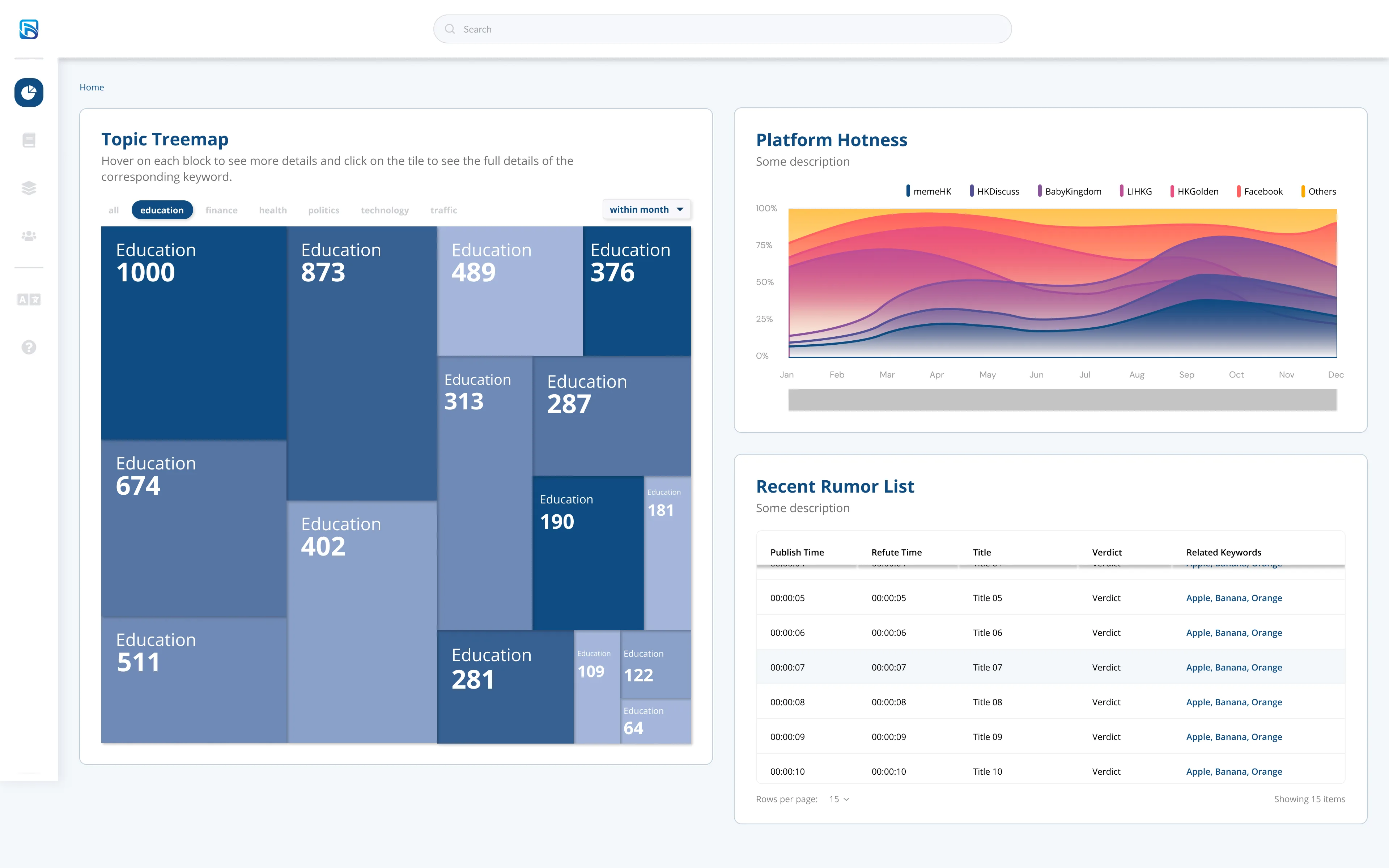
Education
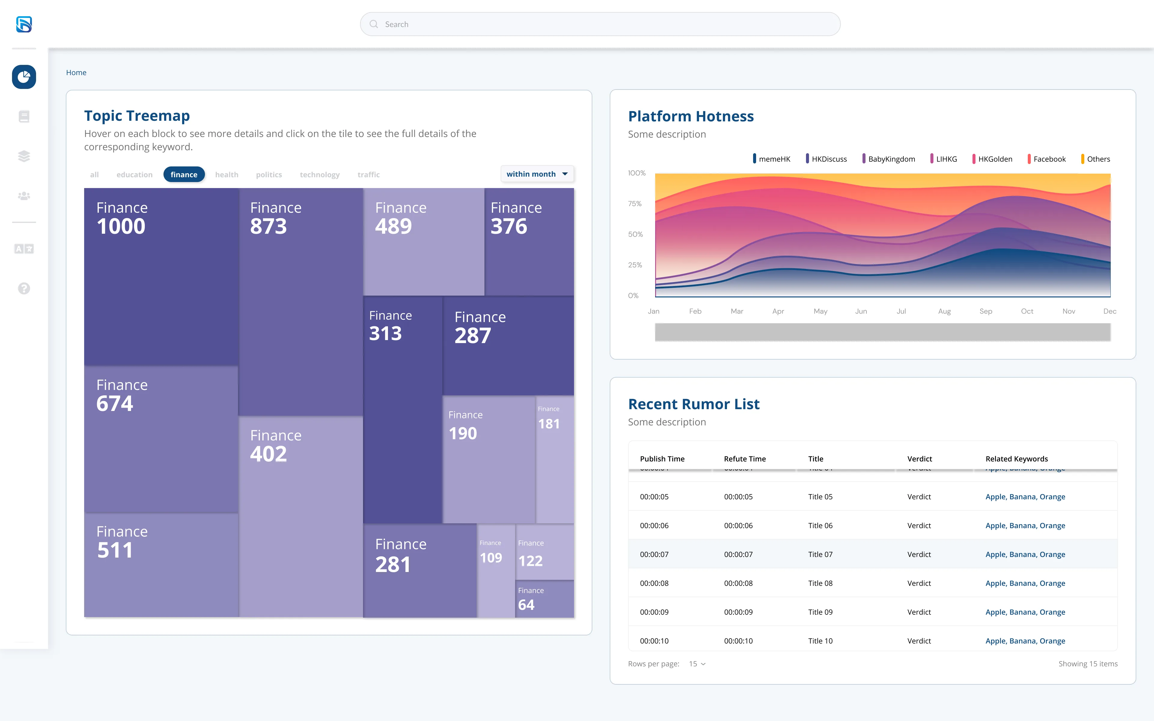
Finance
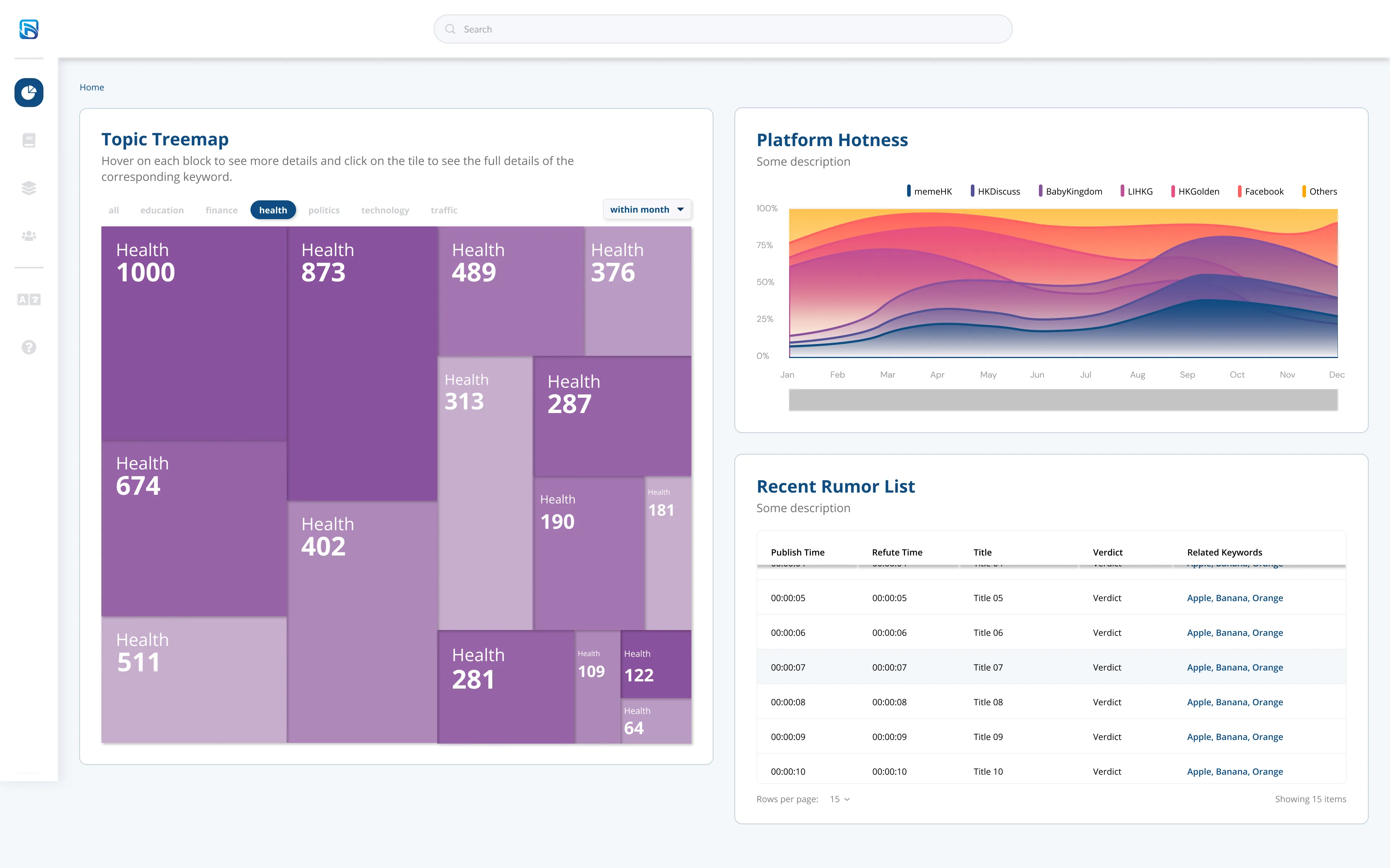
Health
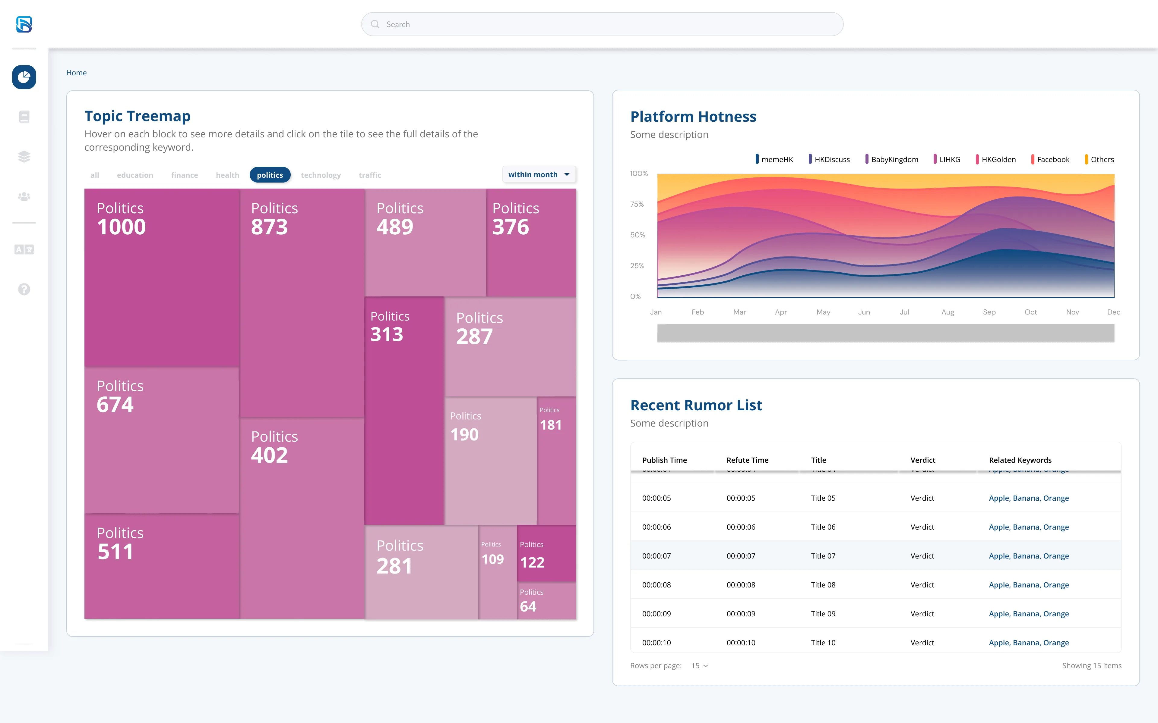
Politics
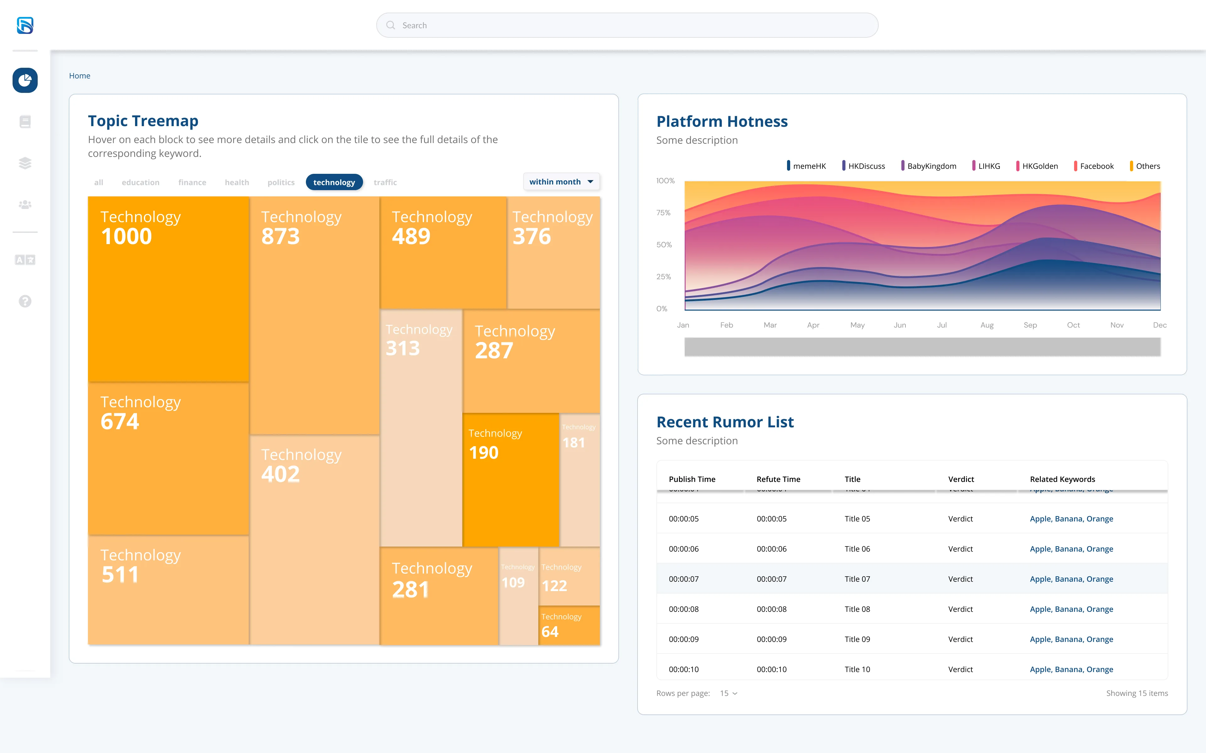
Technology
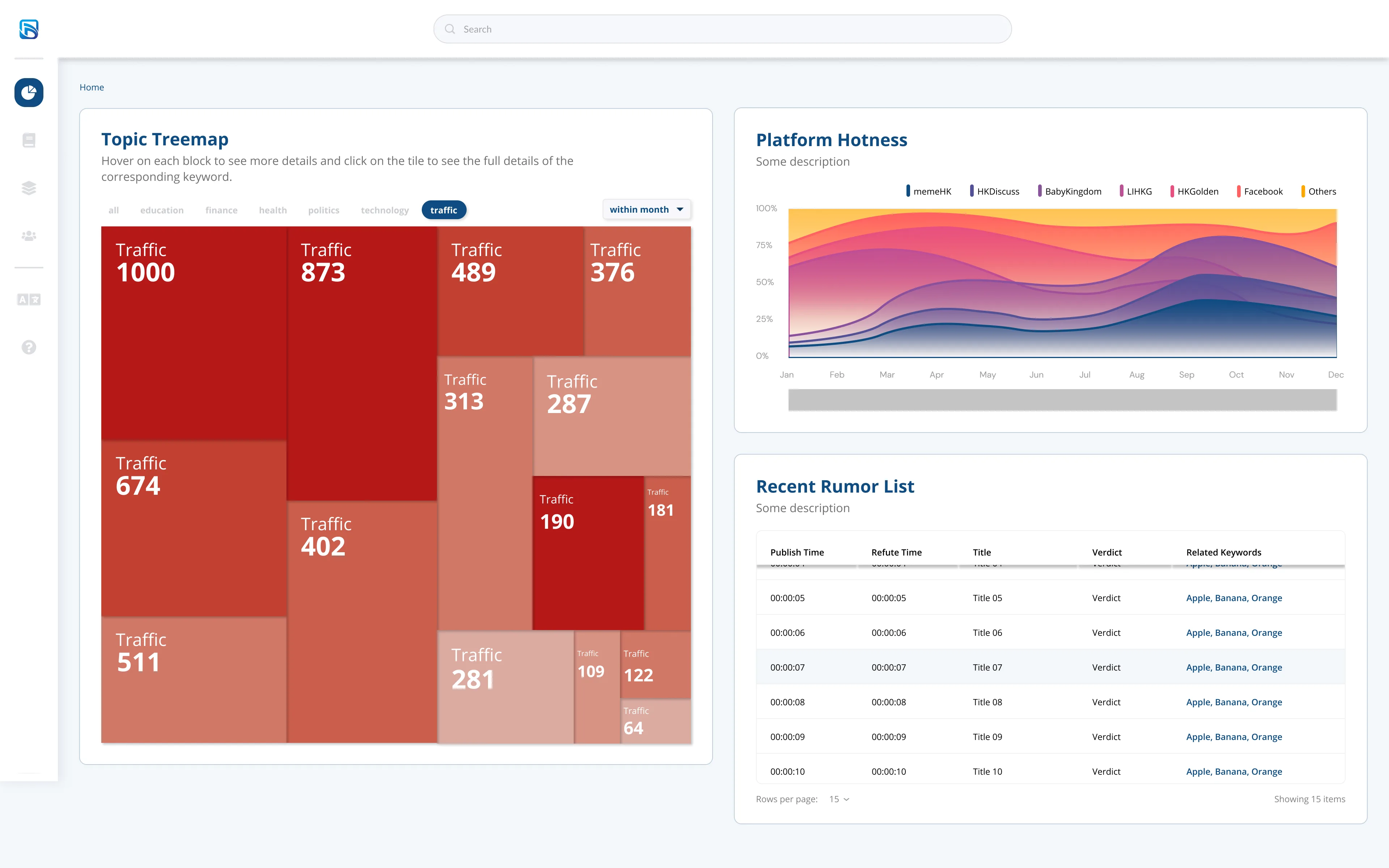
Traffic
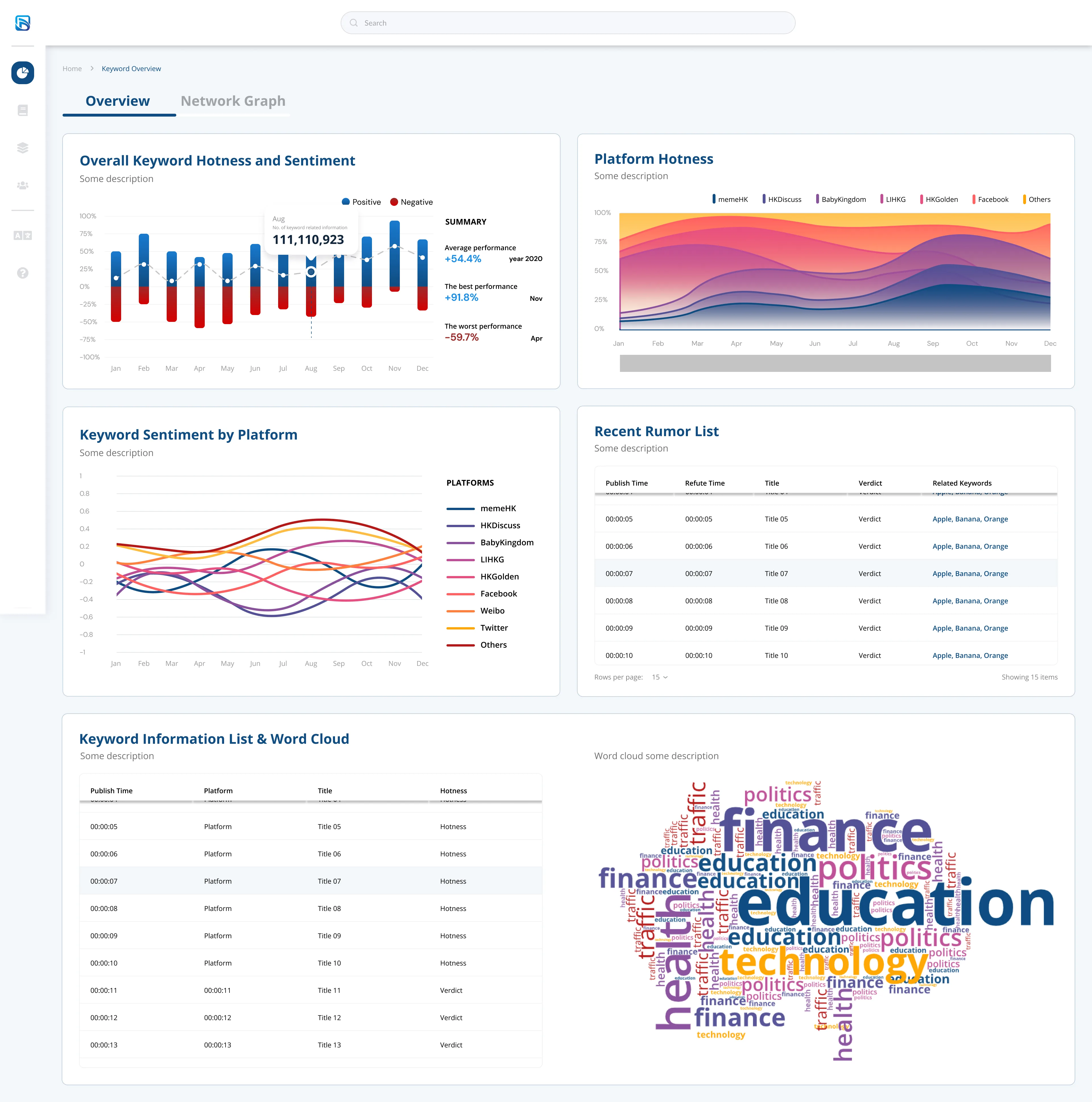
Overview
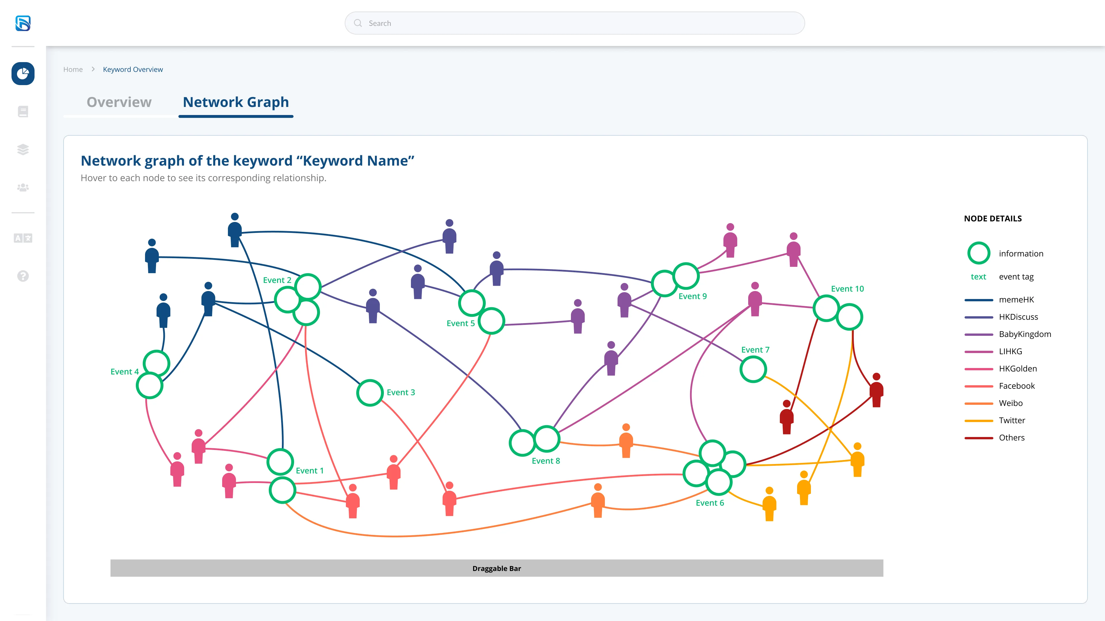
Network Graph
Rapid Prototyping & Collaboration
Given the incredibly tight one-week timeline, I had to move fast and maintain constant alignment with the developer and two data scientists.
Instead of just focusing on making the UI "vibrant," my primary goal was ensuring that complex components—like the tables tracking publish times, refute times, and final verdicts—were highly scannable and technically feasible to build within our sprint constraints. It was a great exercise in balancing aesthetic clarity with raw, heavy data visualization.