OVERVIEW
DatagoTech is one of Datago Technology's app, a financial news risk management with the combination of text analytics & search technology from news, searches and social media from a wide range of industries. Users can find the most real-time financial information such as news, social media posts, announcements and research reports as well as the relationship between this information. For instance, the companies associated with a person and their respective news. Through DatagoTech's intelligence monitoring of competitors, ours clients can enhance returns, reduce risk, improve operational efficiency and most importantly to make relevant and right decisions.
TIMELINE
October 2020 - May 2021
MY ROLE
UX/UI Designer
THE TEAM
Solo designer, CEO, 2 developers, 3+ data scientists, and 1 QA Engineer
TOOLS USED
Figma, Illustrator
Strategic UX Audit & Problem Definition
When I joined the team, I inherited an initial draft of the search and filtering experience. My first step was to run a UX audit to see where users might get stuck. I found three main issues to tackle:
- Too much noise:
The filter system showed everything at once, which was overwhelming. We needed a way to hide advanced options until they were actually needed. - Confusing structure:
It wasn't clear how the news tags related to the active filters, which broke the flow when analysts were trying to dig into specific reports. - Missing visual cues:
The interface lacked the subtle interactions (like hover states and clear active selections) that users rely on when navigating dense data.
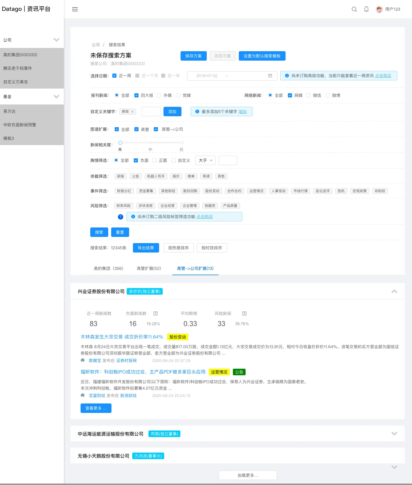
Search Result V3 A
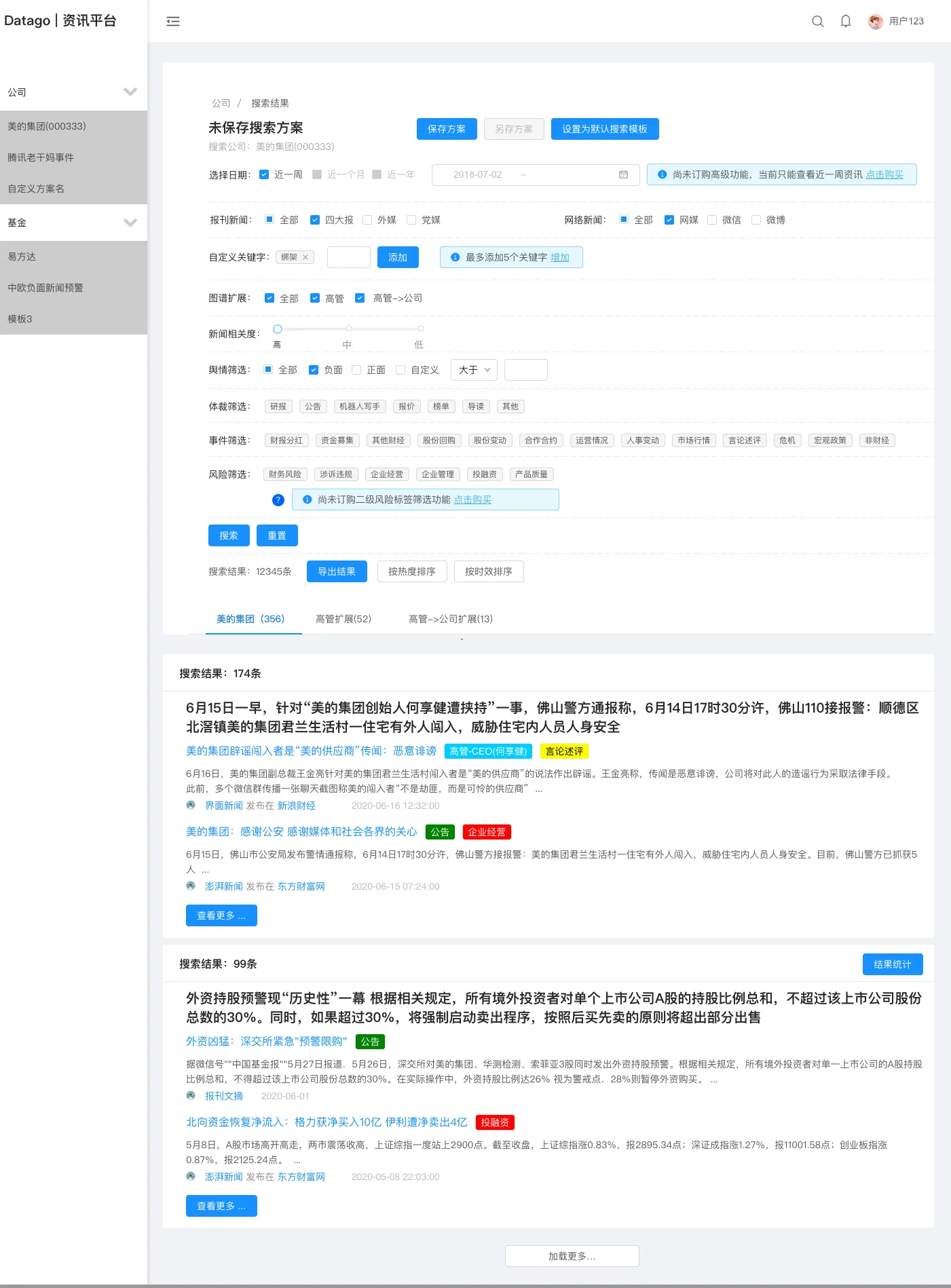
Search Result V3 B
Iterative Prototyping & Architecture
Because we were building a complex, data-heavy platform from scratch, I intentionally held off on high-fidelity visual design. Instead, I focused on rapid wireframing to map out the big picture.
Exploring Multiple Solutions
In product design, there is rarely just one right answer. I created several design alternatives for our core workflows—like testing whether users preferred moving items one-by-one or using bulk actions. After running these past our stakeholders and doing some testing, we went with the bulk-action route to save our users time.
Data Visualization & Cross-Border Localization
As our data scientists improved the text analytics, our users asked for better charts to track positive, negative, and neutral market sentiment over time.
The Cultural Color Dilemma
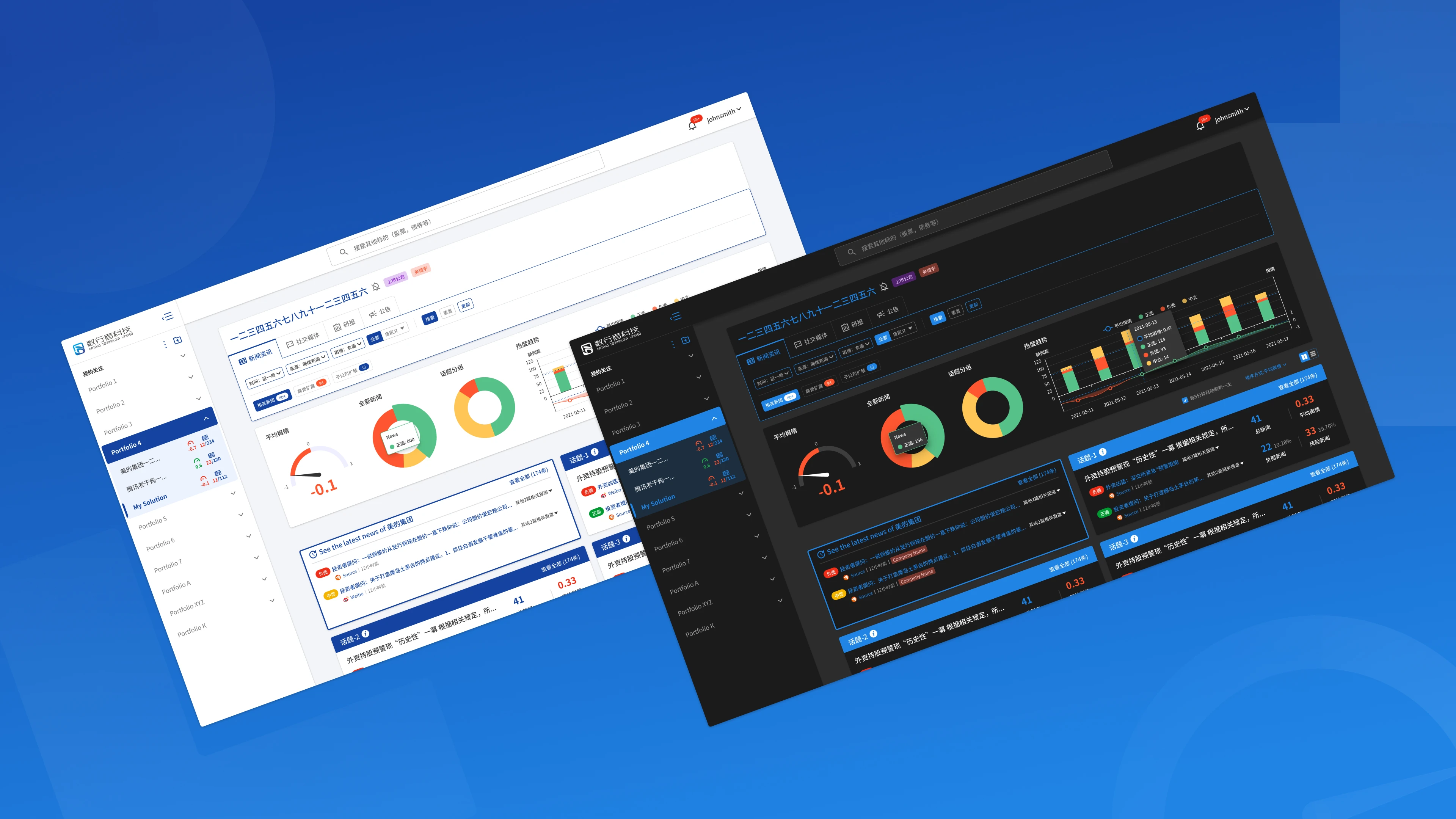
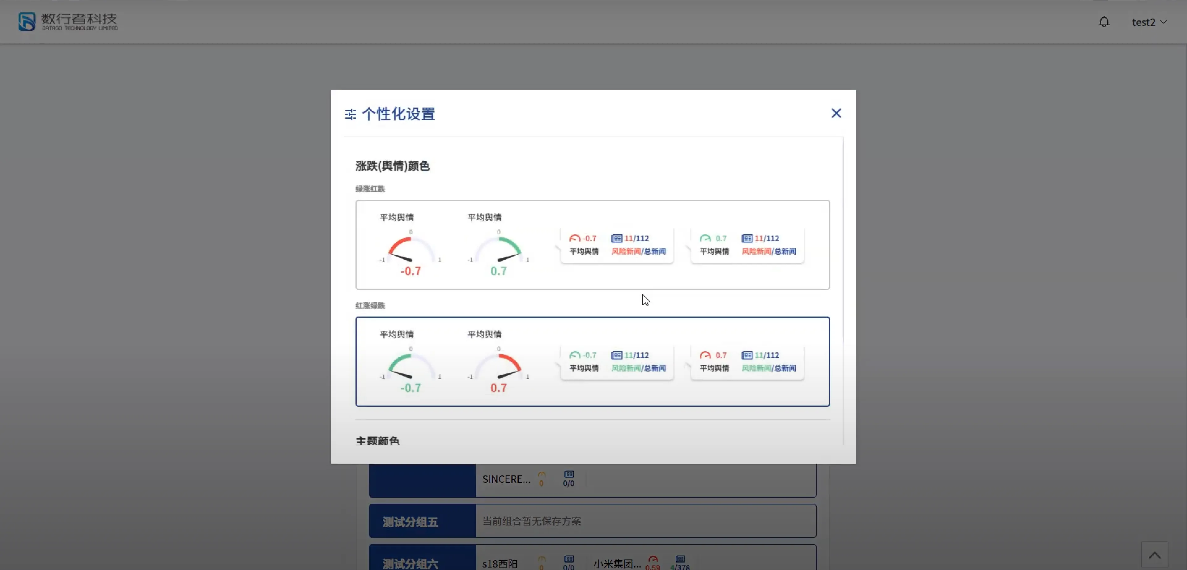
This led to an interesting localization challenge. In mainland China, the color red means a stock is up (positive), and green means it's down (negative). But for international users, it's the exact opposite. To prevent any costly misunderstandings, I designed a simple global color-preference switcher so users could easily toggle the UI to match their local market standards.
*Ignore the solid blue and green color tags, we just disabled them for the time being as we are still optimizing the data accuracy.
Red/Green Switcher
.webp)
Preference (Display)
Design System
ACCESSIBILITY
I mainly used contrast checker tools like Web Aim and the browser's inspect mode to check whether the color choices and font sizes meet the passing criteria for better legibility. Also used Material Design's tool for generating the color variations from lighter to darker options. Since this is my first project to deal with a light & dark theme mode, I referred a lot to Web Aim, Apple's Human Interface Guidelines, and other design systems like Atlassian, and some articles on Medium to understand best practices for dark theme mode like the different elevations where the background color gets lighter and the shadows spread more for better overlapping visuals.
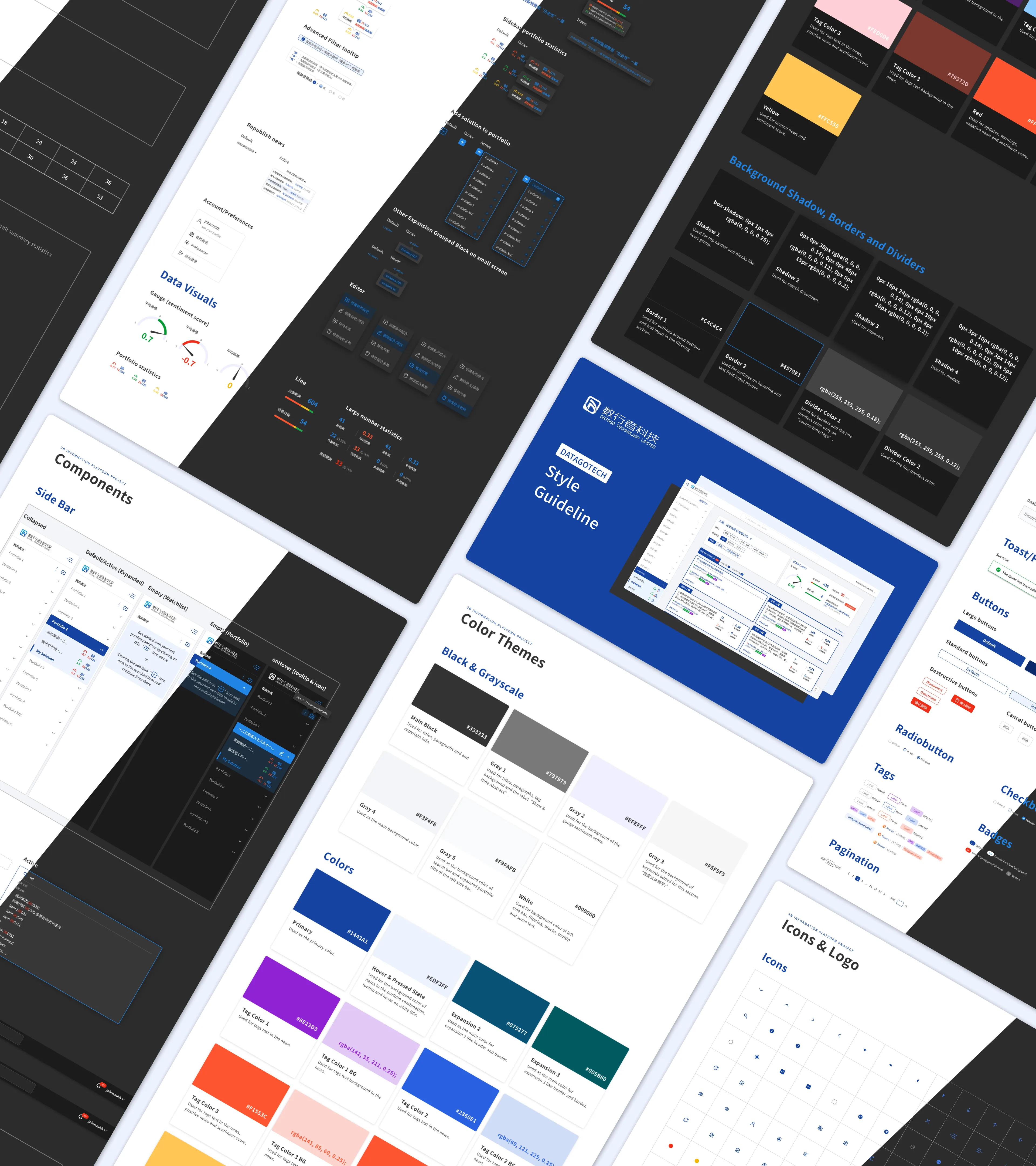
Design System

Icons & Logo
Agile Validation & Engineering Handoff
We ran on tight weekly and bi-weekly sprints. At the end of each cycle, the product team tested our new features directly with university professors (one of our primary user bases) to gather feedback.
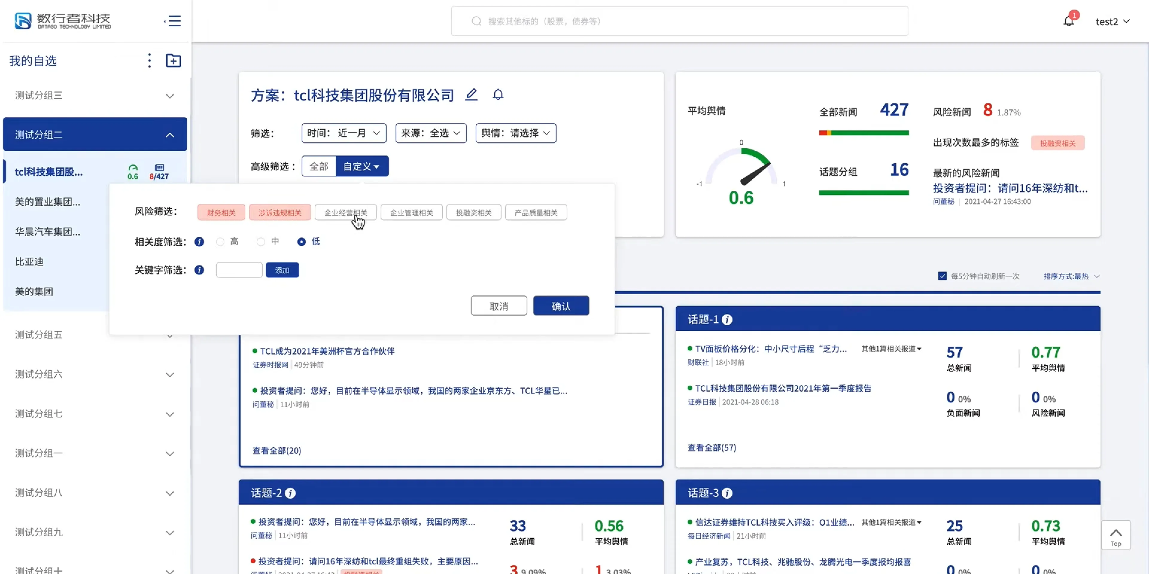
To keep up with this fast pace and ensure the UI scaled gracefully, I had to make smart layout decisions. For example, instead of relying on popups that might break or get lost on smaller laptop screens, I moved our complex filters into a responsive, fixed sidebar.
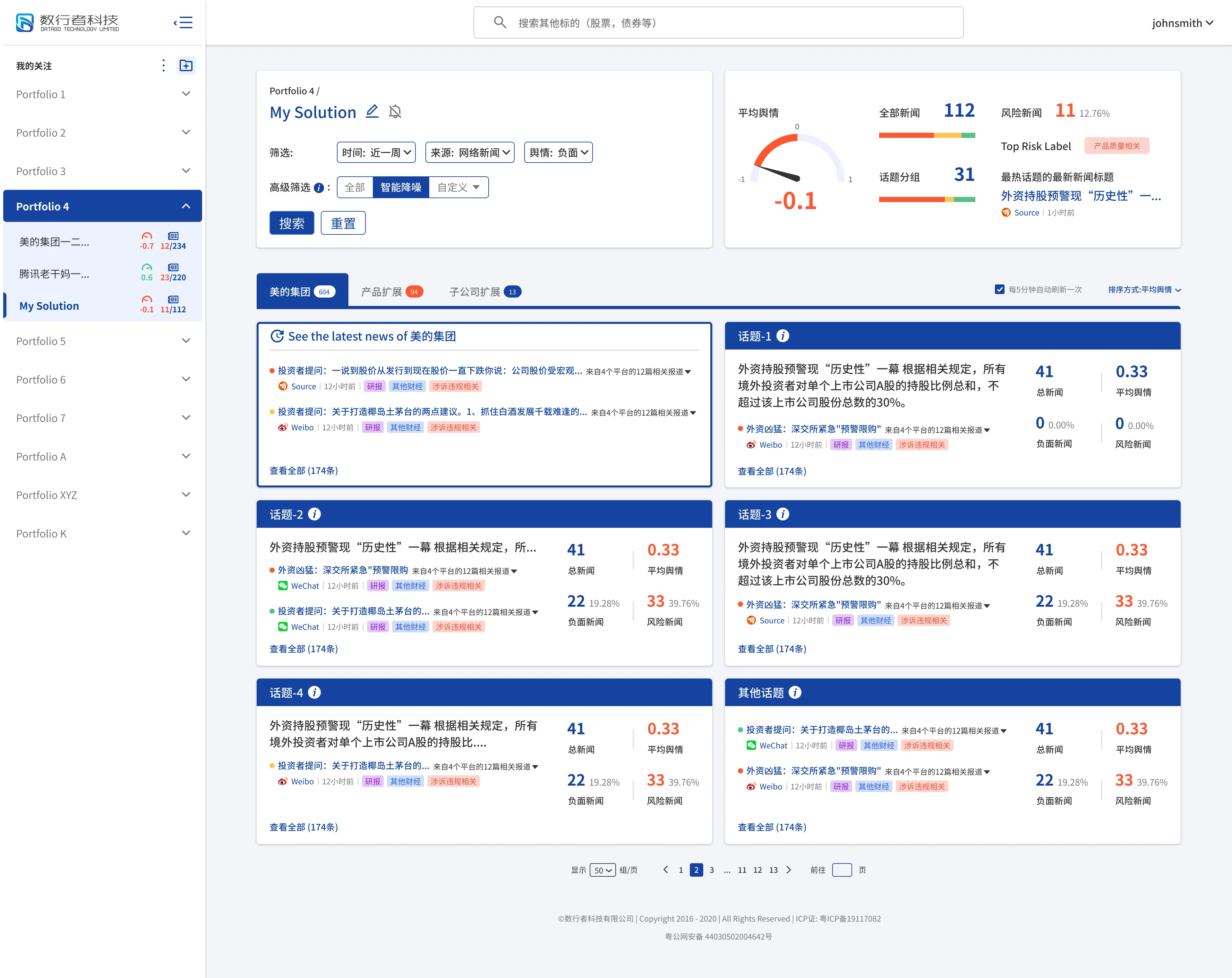
Searched Result (April)
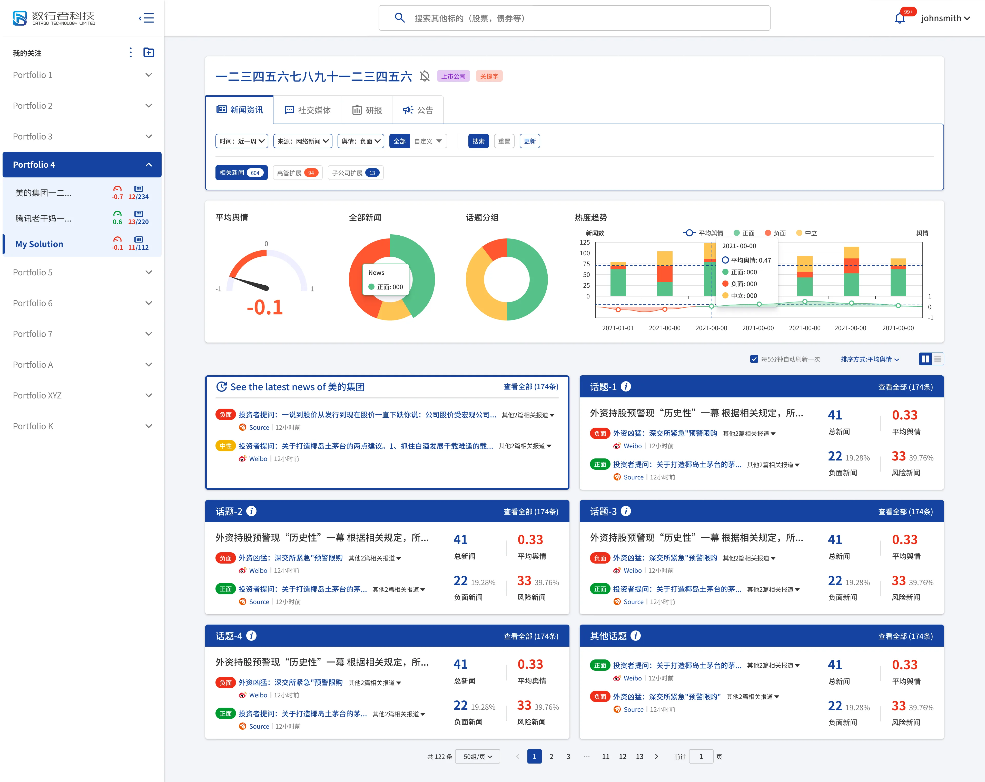
Searched Result (May)
Filter (April)
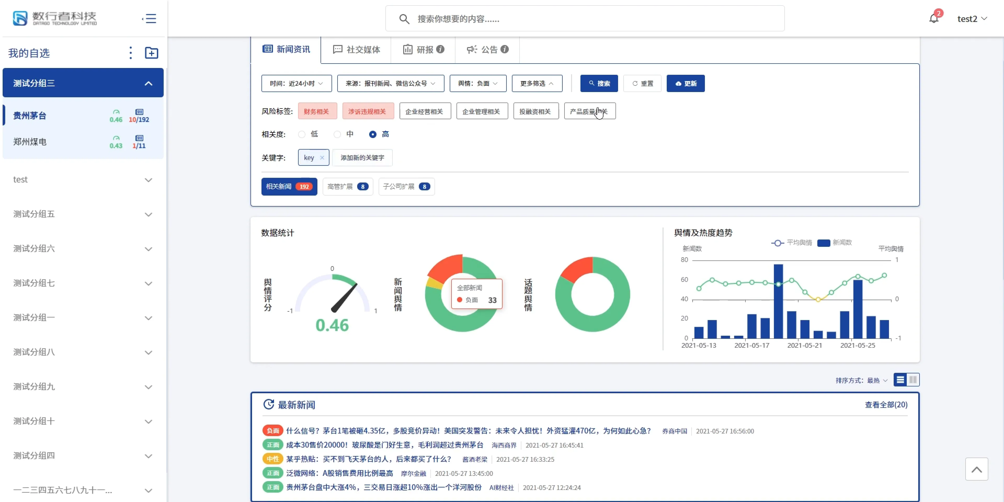
Filter (May)
As you can see in these two versions, we made a lot of optimizations on the app and added more feature requests. As mentioned above in the design alternatives section, I created several options for how a feature can be used. As new requests come in, I may forget some ideas, so while the idea is still fresh, I simply build a quick wire flow.
Reflection & Product Leadership
Designing for a data-heavy startup taught me a lot about prioritization. Early on, I made the mistake of worrying too much about making the UI look perfect.
I quickly realized that taking a step back and talking to the engineers and data scientists was far more valuable. By understanding their technical limitations and focusing on the accuracy of the data first, we were able to build a much better product. It was a great lesson in learning to let go of pixel-perfection early on, realizing that a functional, technically sound product in the hands of users always delivers more value than a flawless draft.