
OVERVIEW
MO Shop started on Shopify. It made sense at the time: get something live quickly, start selling, and worry about the details later. But as the product grew, the platform started getting in the way. Prices kept changing, customising anything beyond the basics was a headache, and even small updates took longer than they should.
The decision was made to move to a fully custom-built site. More control, no platform limitations, no surprise fees. Our tech lead set up the initial infrastructure — the tech stack and Render deployment — to get the shop running, then handed the project off to me to take it from there.
The dev team were on backend work (Stripe, transactional emails, analytics), so the entire frontend was mine to own. That meant design in Figma, implementation with Claude Code, and pushing, merging, and deploying entirely solo. Moving fast meant cutting corners though. Colours were hardcoded everywhere, fonts were inconsistent, product pages weren't showing up on Google, and there was nothing documented for anyone new joining. Cleaning that up was the other half of the job.
TIMELINE
January 2026 to May 2026
MY ROLE
UX Engineer
THE TEAM
Solo UX Engineer, 1 Product Manager, 1 Engineer, 1 Graphic Designer
TOOLS USED
Figma, Next.js 16, TypeScript, Tailwind CSS v4, Claude Code, PostHog, GA4
The Problem
MeeOpp sells dozens of educational course packs, each requiring unique pricing tiers, bundle rules, and user journeys. Initially launched on Shopify for speed, the platform's rigid theme system quickly became a bottleneck. Customizing layouts for different user segments or optimizing the purchase flow required fighting the platform rather than building for the user.
- Hardcoded Colors: Colors were written manually instead of using a unified system.
- Fragmented Typography: There was no single place to manage fonts across the site.
- Broken User Journeys: Core product pages suffered from broken SEO and dead links.
- Zero Documentation: There was no guide for new developers to follow.
Figma to Production
Architecting an Accessible Foundation
Before writing a single line of code, I engineered a comprehensive design system in Figma. This included a rigorous color taxonomy (10 families, 10 shades) with built-in WCAG contrast compliance for both light and dark modes. Every UI element was exhaustively spec'd to prevent downstream guesswork — the button library alone covered 11 types across 5 states, sizes, and icon configurations, providing every possible combination a developer might need.
AI-Driven Design-to-Code Workflow
With the engineering team fully occupied on backend infrastructure, I took end-to-end ownership of the frontend. I bridged the gap between design and development by connecting Figma directly to Claude Code via an MCP server. By tagging design frames, Claude could read the established design language and immediately translate it into matching frontend code. What normally requires a lengthy handoff cycle between two separate roles was executed in a single, continuous session.
End-to-End Delivery
This AI-assisted workflow allowed me to move with unprecedented speed while maintaining pixel-perfect quality. I managed the entire UI lifecycle — from the first strategic design decision in Figma through to reviewing diffs, committing code, raising pull requests, and deploying to production.
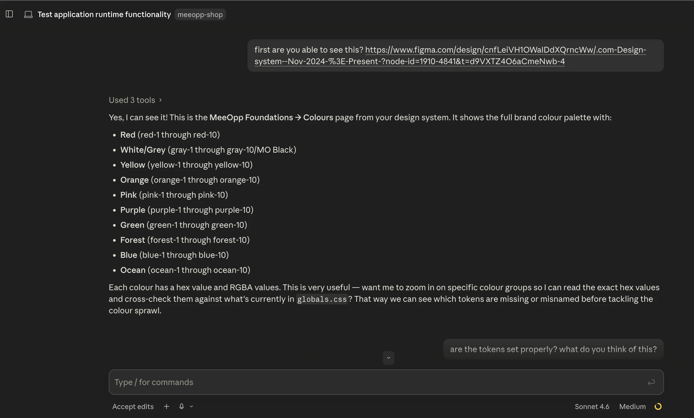
Claude Code reading a tagged Figma frame and matching the code to it
Figma frames tagged for Claude Code to reference
Design System & Technical Architecture
Syncing Figma and Code Automatically
I wanted Figma to be the absolute source of truth. Instead of passing around raw hex codes, I set up a Tailwind token system (like text-ocean-6) so the design and code shared the exact same vocabulary. Because I connected Figma directly to Claude Code using an MCP server, I could just tag a design update in Figma, and Claude would automatically write the correct token into the codebase. This workflow made it easy to clean up hardcoded colors scattered across the codebase, keeping everything perfectly in sync. I did the same thing for spacing, locking everything to a strict 4px grid so we never had to guess pixel values again.
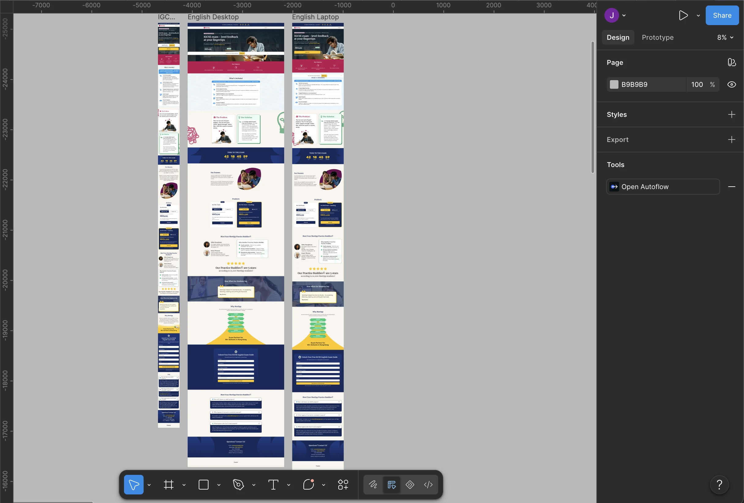
Designing for Real Mobile Users
Since our buyers are mostly parents browsing on their phones, building mobile-first was a necessity, not just a buzzword. I designed everything for a small 375px screen first, then scaled up for tablet and desktop. I focused heavily on making sure the site was actually easy to navigate with a thumb, ensuring all buttons, menus, and clickable areas were comfortably sized for mobile interaction, and that our components adapted seamlessly across all devices.
Typography and Localization
I cleaned up our messy fonts by setting one consistent rule across the whole site: Rubik for body text, Merriweather for headings, and Noto Sans TC to seamlessly handle our Traditional Chinese translations.
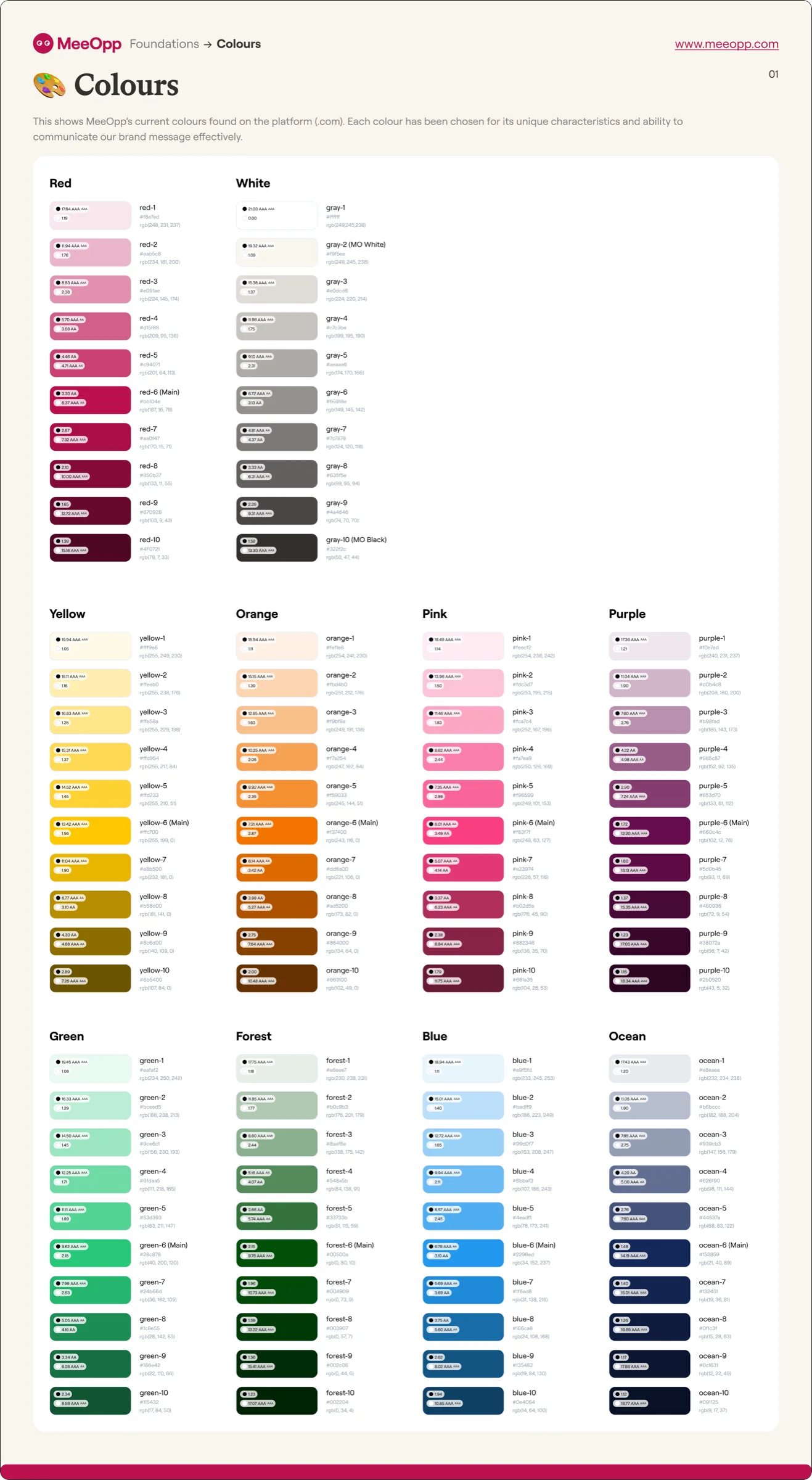
Colour system — 10 families × 10 shades with WCAG contrast annotations
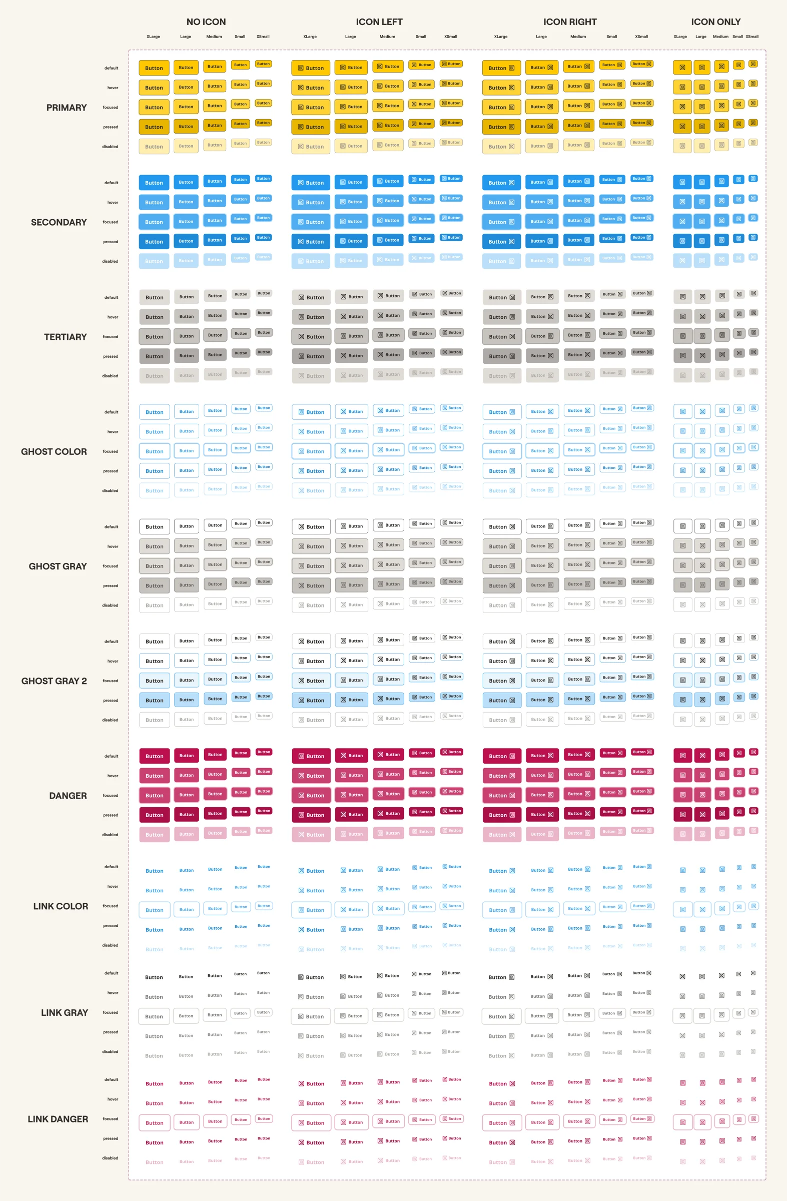
Button library — 11 types × 5 states × 5 sizes × 5 icon configs
Project Handoff & AI Automation
I knew I was handing this project off to a team member without a traditional development background, so the setup had to be completely foolproof. The original README was only four lines long, so I completely rewrote it into a clear, 8-step guide aimed specifically at non-technical users. To make the handoff truly seamless, I wrote a single-command setup script that handles all the technical dependencies quietly in the background. I also extended Claude Code's session instructions: now, when the new owner opens the project, Claude checks their environment and actively guides them with plain-English instructions if anything is missing, rather than letting them stumble into confusing terminal errors. This meant anyone could spin up the project and manage updates on day one without needing a developer to hold their hand.
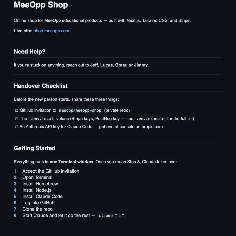
The actual handover checklist and 8-step guide from the project README
SEO, Accessibility & Broken Journeys
While auditing the site, I noticed we were losing potential users before they even reached the shop. Several product pages were accidentally set to "don't index" on Google, the bilingual signals for English and Chinese weren't configured correctly, and the sitemap was returning an error. I fixed these indexing issues at the source and completely overhauled the meta tags across all pages to ensure our products showed up correctly and attractively in search results. Furthermore, because we were targeting American users, I prioritized accessibility (a11y) compliance across the frontend, ensuring the site met stringent international usability standards.
During this audit, I also caught a critical bug: 9 course pages were showing up in our navigation but leading users straight to a 404 error. I rebuilt those missing pages from scratch in both languages, wired up the product data, and updated the sitemap so we were no longer sending our users to dead ends.

Live Lighthouse audit — shop.meeopp.com
Outcome
What used to be a frustrating bottleneck on Shopify is now a streamlined, scalable process. By defining complex pricing tiers, session variations, and bundle options in a single registry file, adding a highly customized course pack now takes a fraction of the time — without having to fight a rigid template.
- Unified Token System: Every color and font now pulls from a single source of truth, meaning a Figma update instantly and safely scales across the site.
- US Market Ready: The platform is fully accessible and properly indexed for international search.
- Restored User Journeys: The site is completely free of dead ends and 404 errors.
The platform is now fully accessible for the US market, properly indexed for international search, and completely free of broken user journeys.
Best of all, the automated setup and AI-assisted guidance mean that non-technical team members can confidently take ownership of the project. They can run it locally and push UI or content updates independently, reserving dedicated developer time only for complex backend architecture.