OVERVIEW
For one of Datago's clients (HKBU), I was tasked with designing an interactive fact-checking dashboard centered on keywords. This is a very straightforward project, as the project manager and client have already agreed on the requirements. Based on the PowerPoint slides, my responsibility was to decide the layout of the dashboard and, particularly, the charts, to give them a vibrant and attractive look.
TIMELINE
Nov 2020 (1 week)
MY ROLE
UI/UX Designer
THE TEAM
Solo designer, 1 developer and 2 data scientists
TOOLS USED
Figma
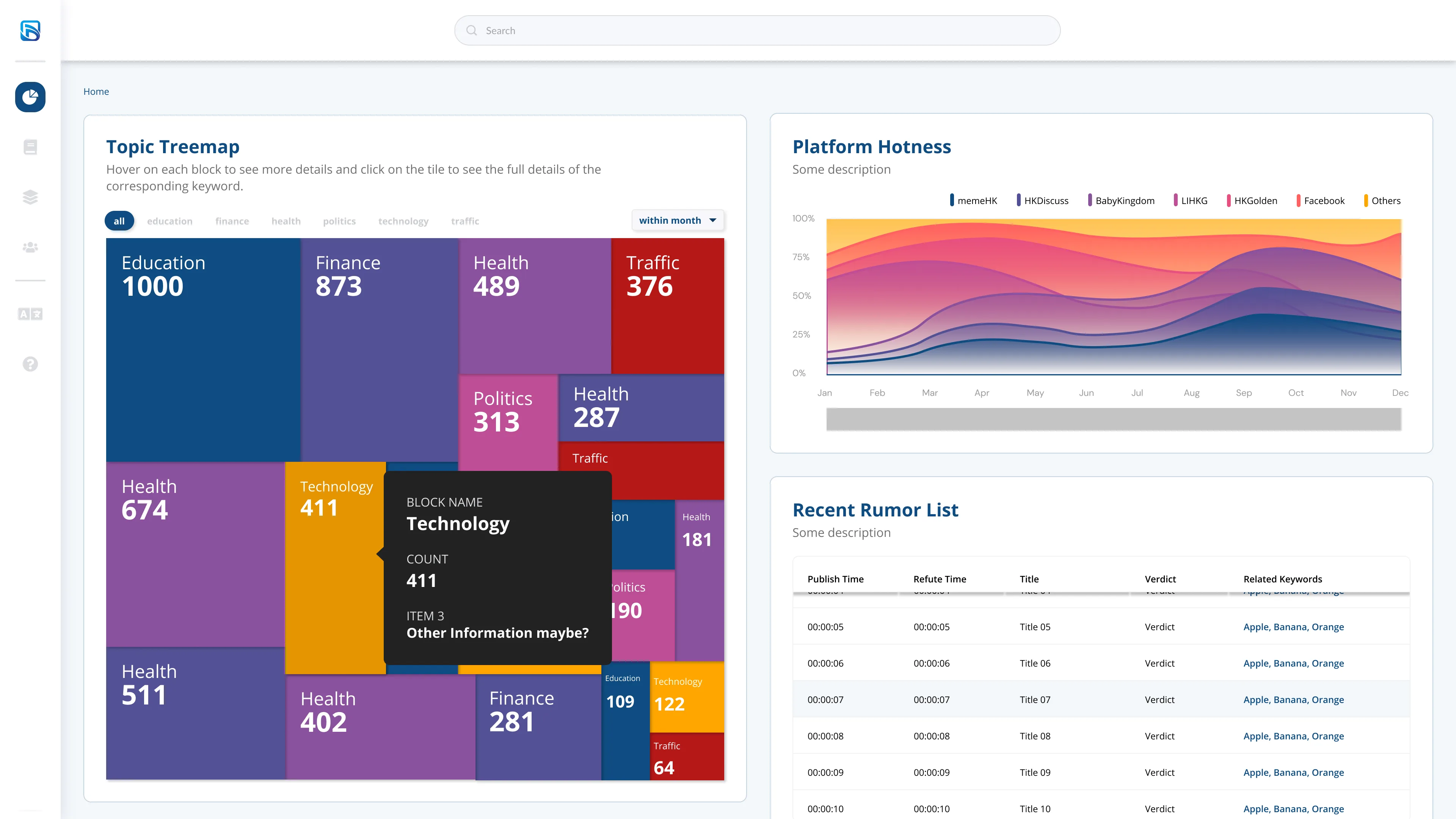
Charts to design:
Treemaps with categorical tabs, able to rearrange map with time scope and redirects to detailed of the keyword by clicking on the tiles
Stacked chart
Tables with publish time, refute time, title, verdict, and related keywords
Word cloud
Bi-directional bar chart
Network Graph for the relationship between user and information/event (with a draggable time bar to show the start to end)
The Design
Dashboard home
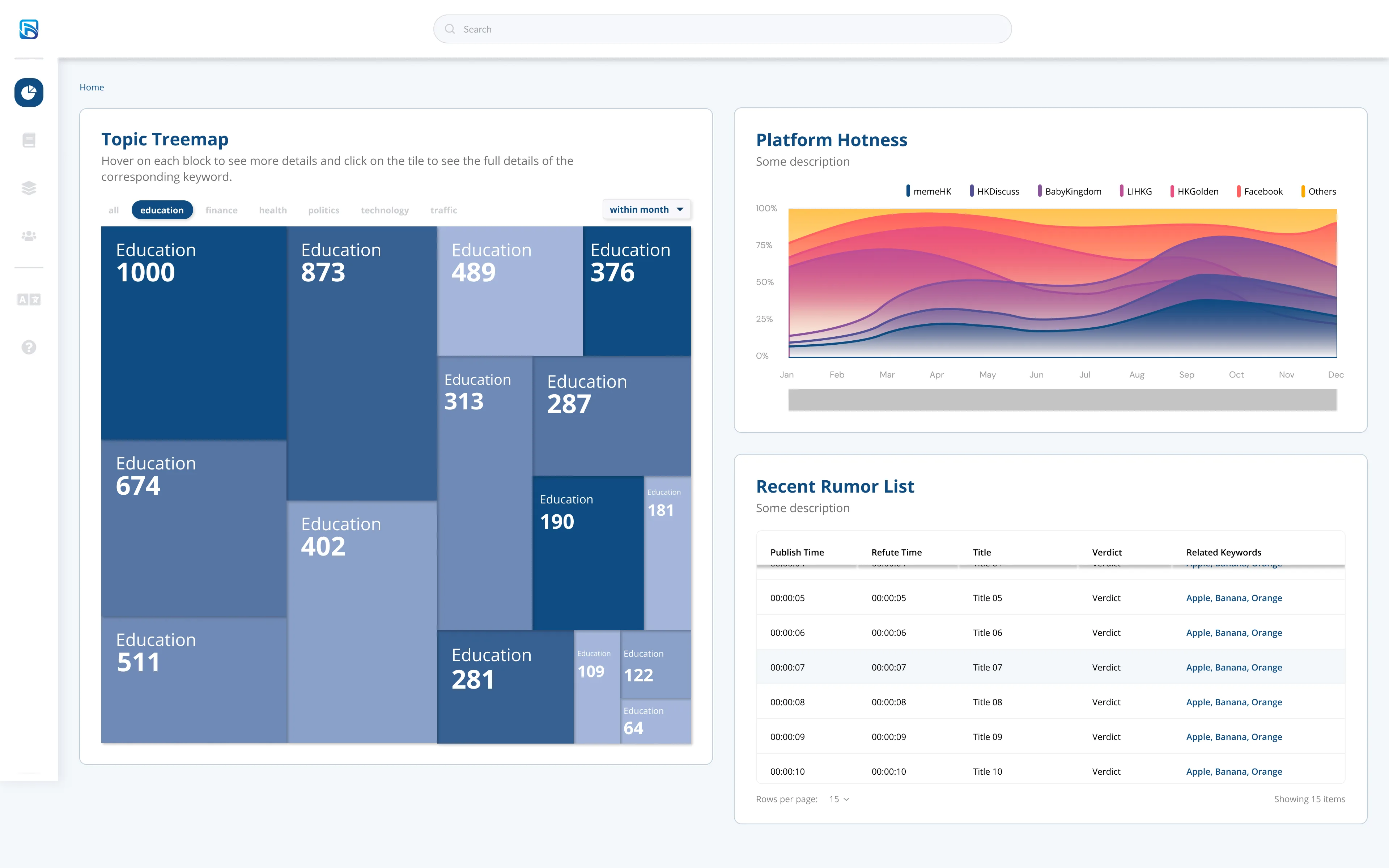
Education
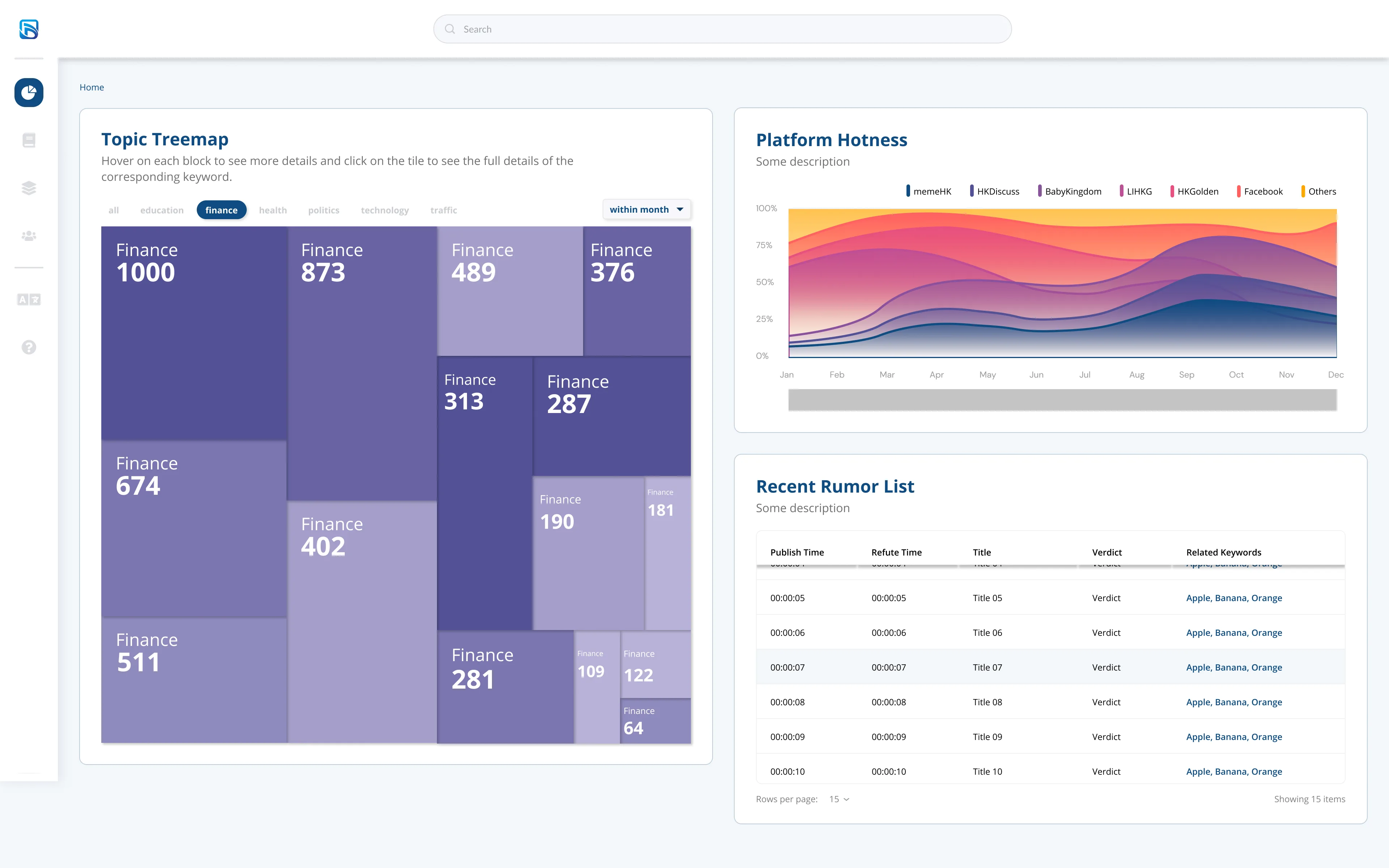
Finance
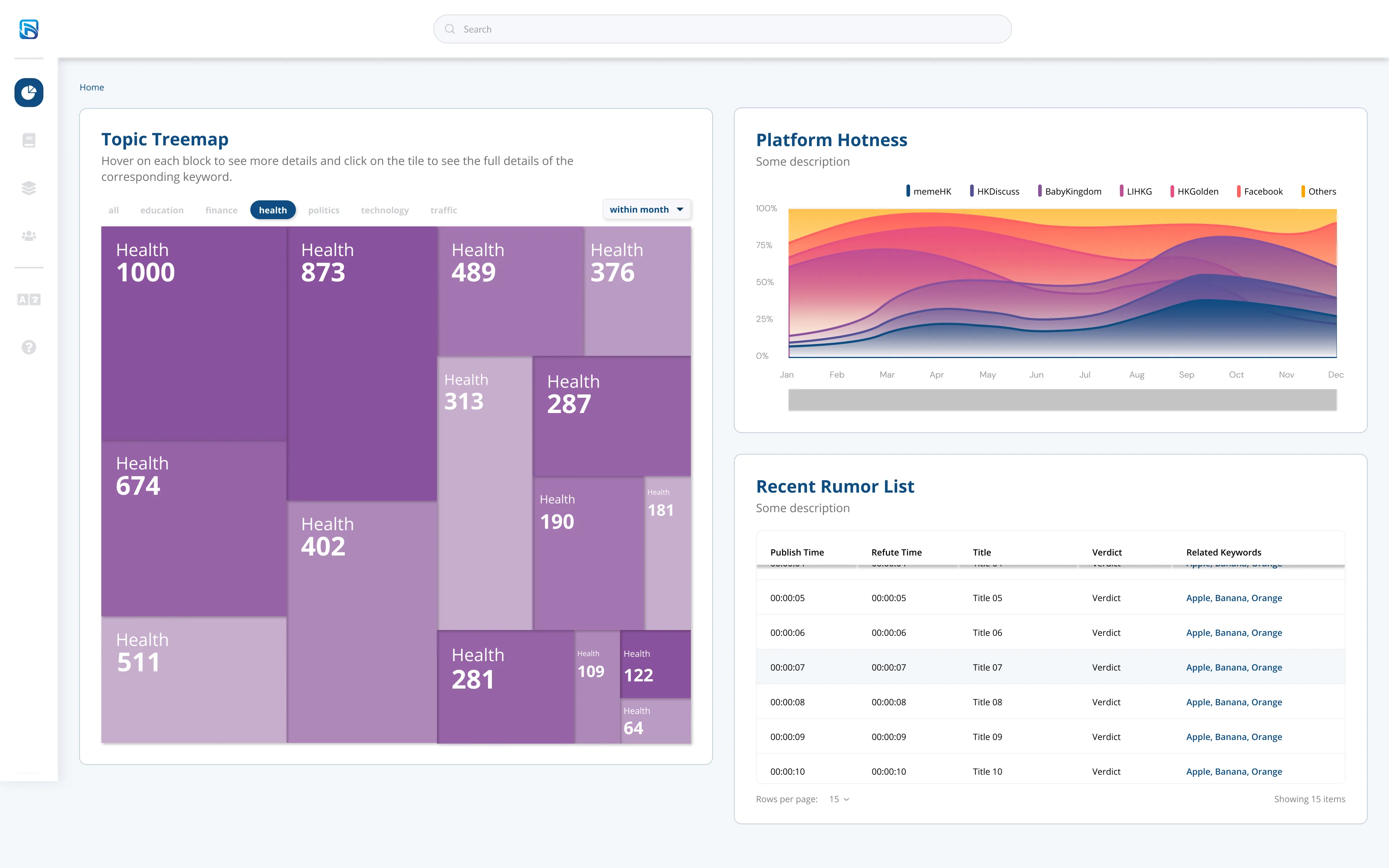
Health
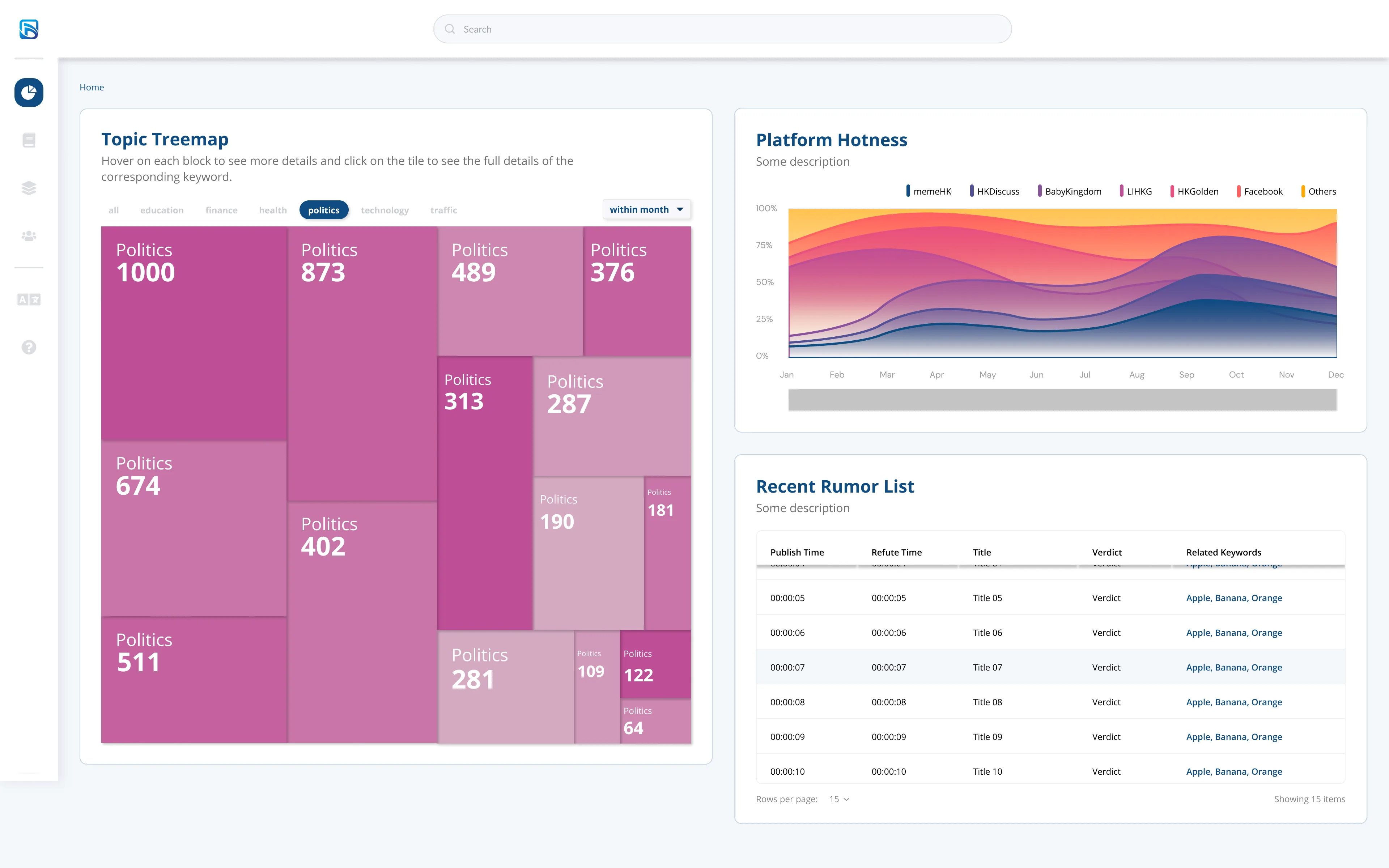
Politics
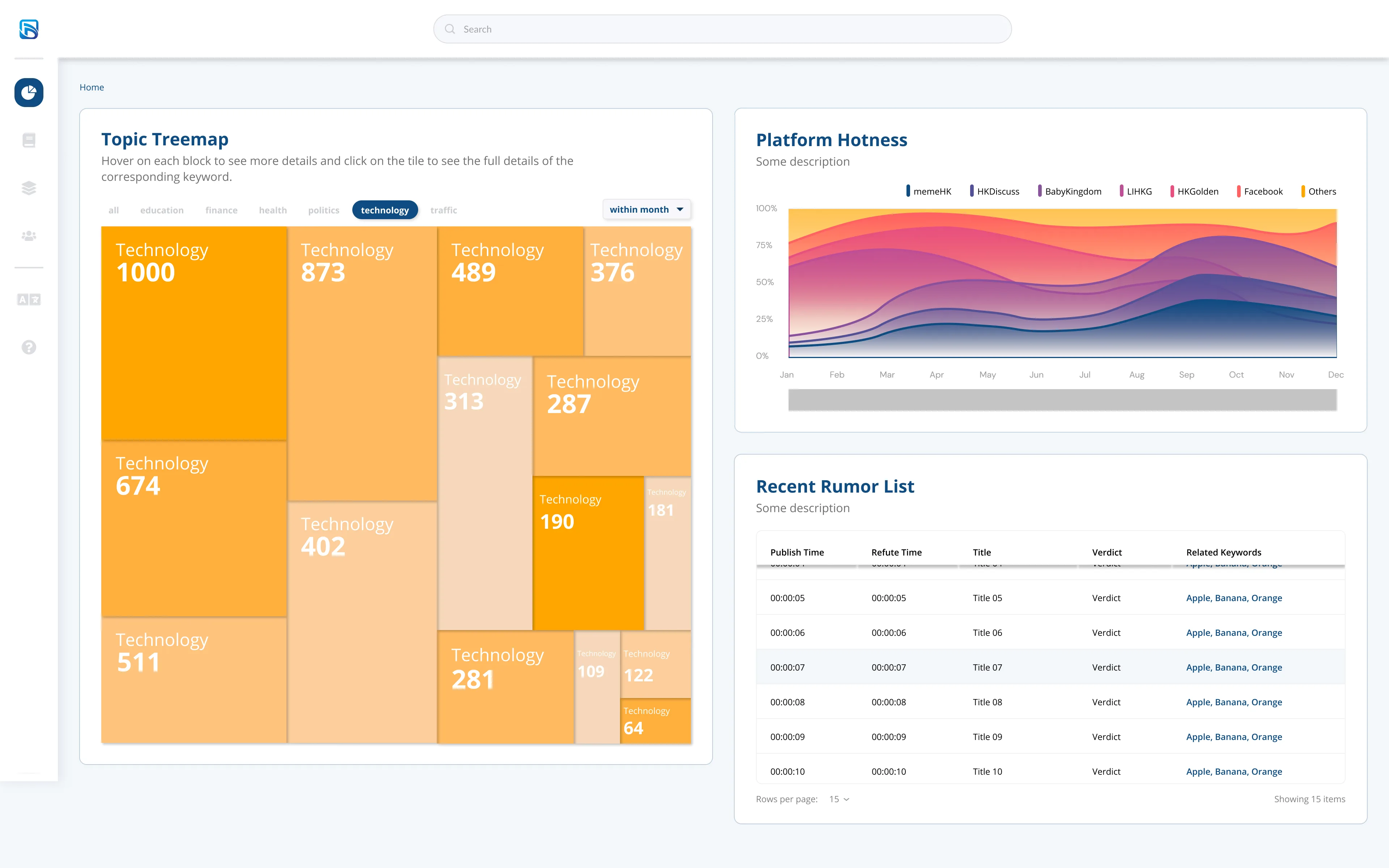
Technology
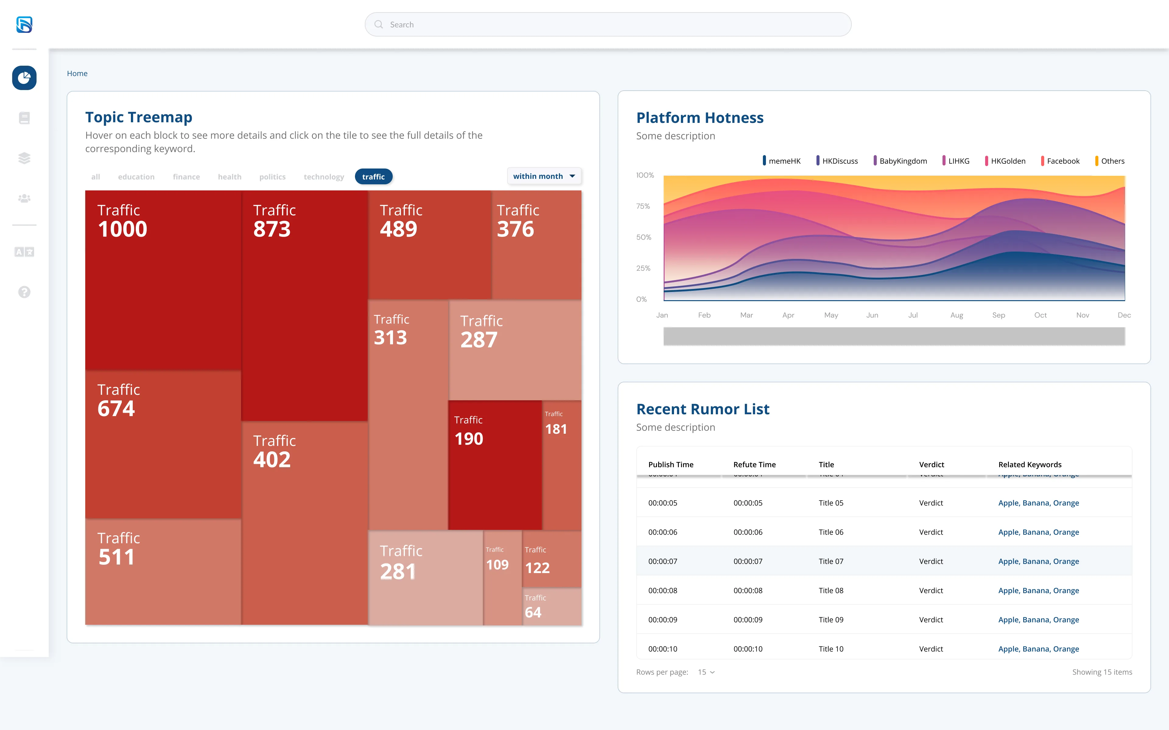
Traffic
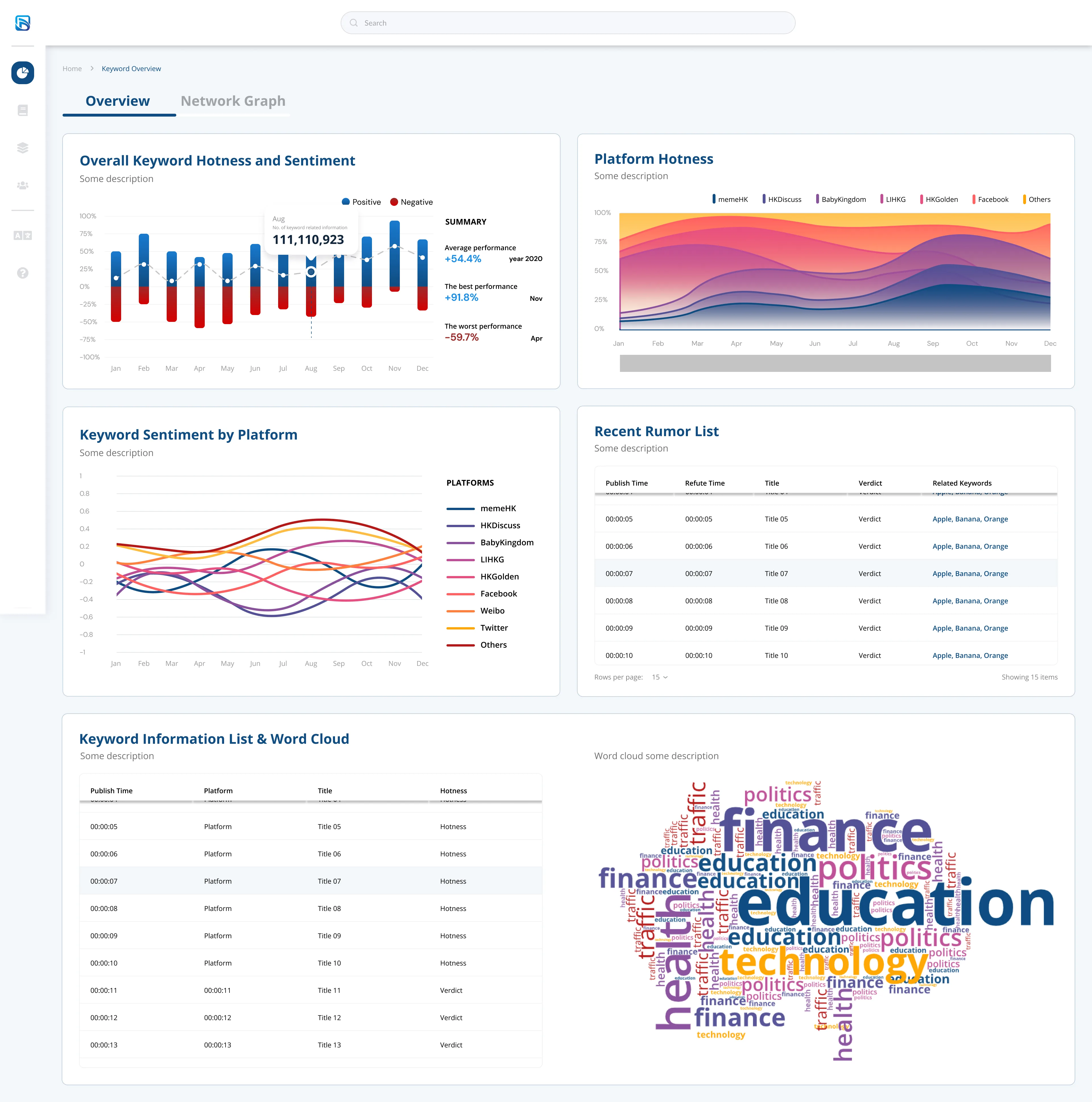
Overview
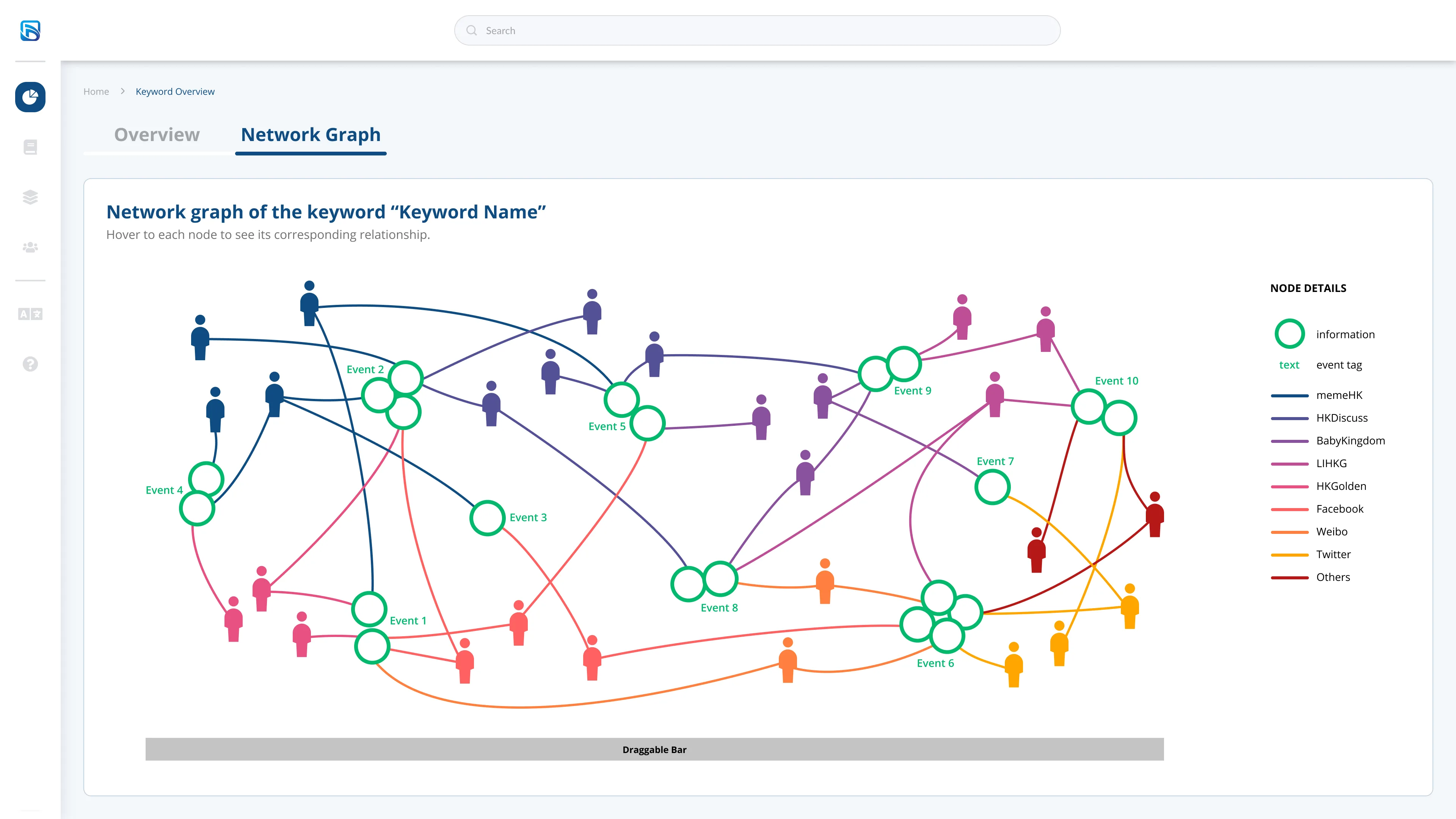
Network Graph