OVERVIEW
To design and launch a working site to showcase the company's work. Cynderian is a multimedia company that solves and innovates diverse creative solutions.
TIMELINE
Jan 2019 - Feb 2019 (4 weeks)
MY ROLE
Web Designer/Developer
THE TEAM
1 designer and 2 developers
TOOLS USED
Adobe XD, Dreamweaver/Atom, GoDaddy
The Breakdown
The Problem
The previous version of their site had issues in representing that with the following reasons:
I made a sitemap to organize the layout of the website.
Overall, it looked like a website that does game illustrations alone rather than what they hoped for which is a diverse creative solution.
Information Architecture
I made a sitemap to organize the layout of the website.
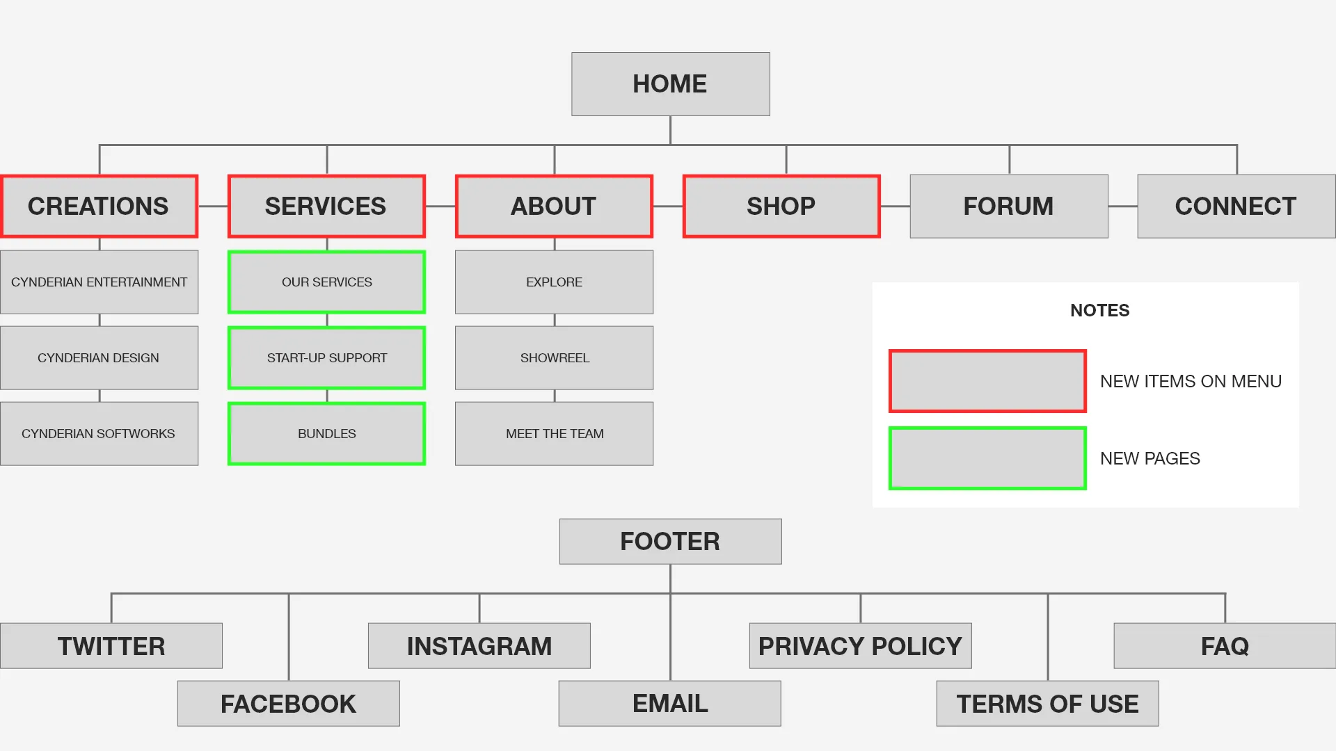
Sitemap
Wireframes
After several iterations, I came up with the following:
1.
The idea behind the big image covering the entire screen on the home is when a user visits, he/she will instantly know what the site is about and offering. As the user scrolls down, different sections are introduced with a title and short description supplied with an image to give a better understanding of the respective section which was lacking in the previous website version.
2.
Throughout the site, an image banner and brief introductory will be presented to the user for an overall insight of what the page they are on is about (which again covers the entire screen) before seeing further content on the page.
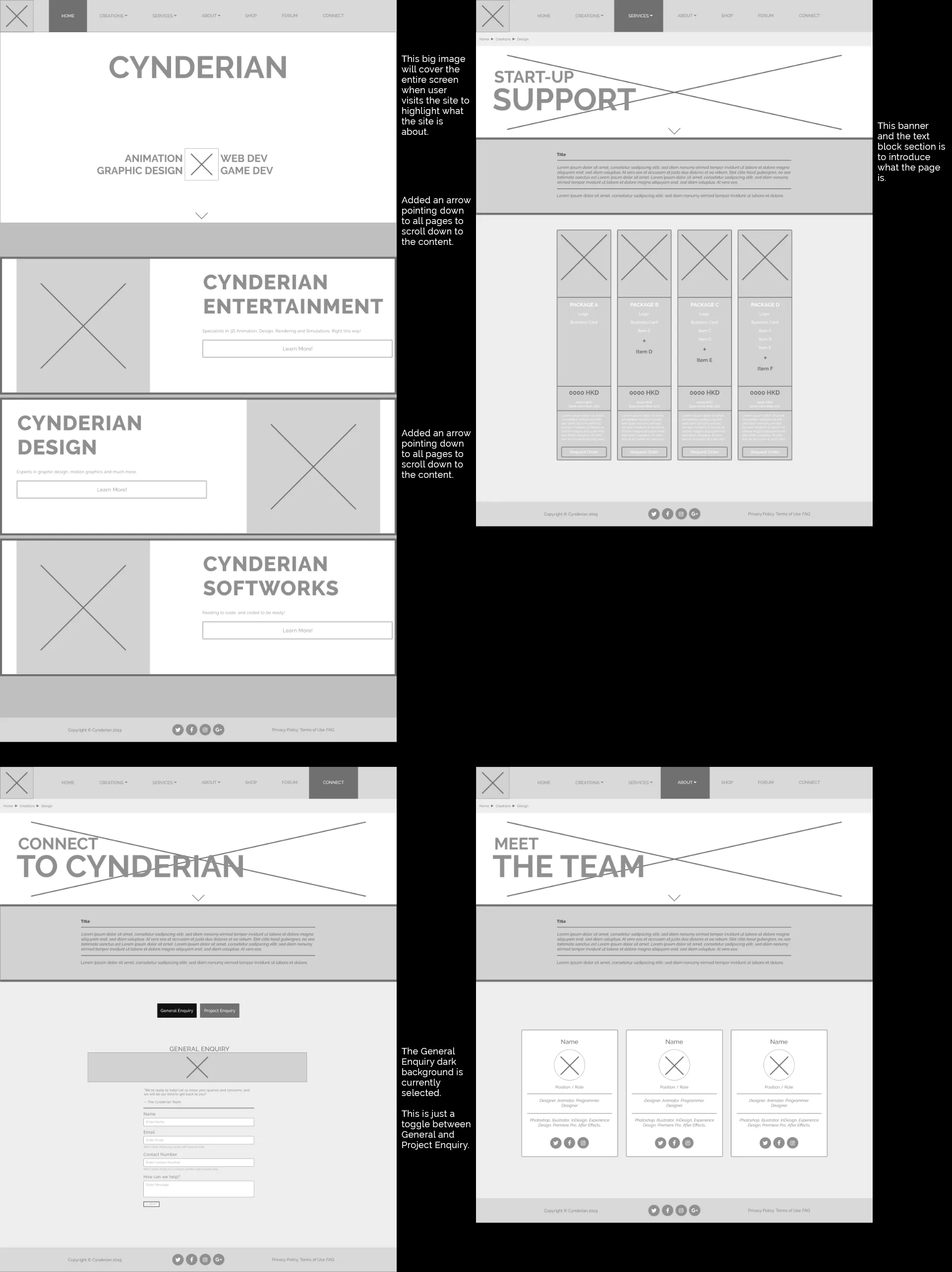
Wireframes 1
3.
To reduce unnecessary extra steps in the user's journey, I proposed the use of popup modals to display more details, which can be seen on the design and services pages. The item's content length isn't worth the extra time and clicks to have its own page.
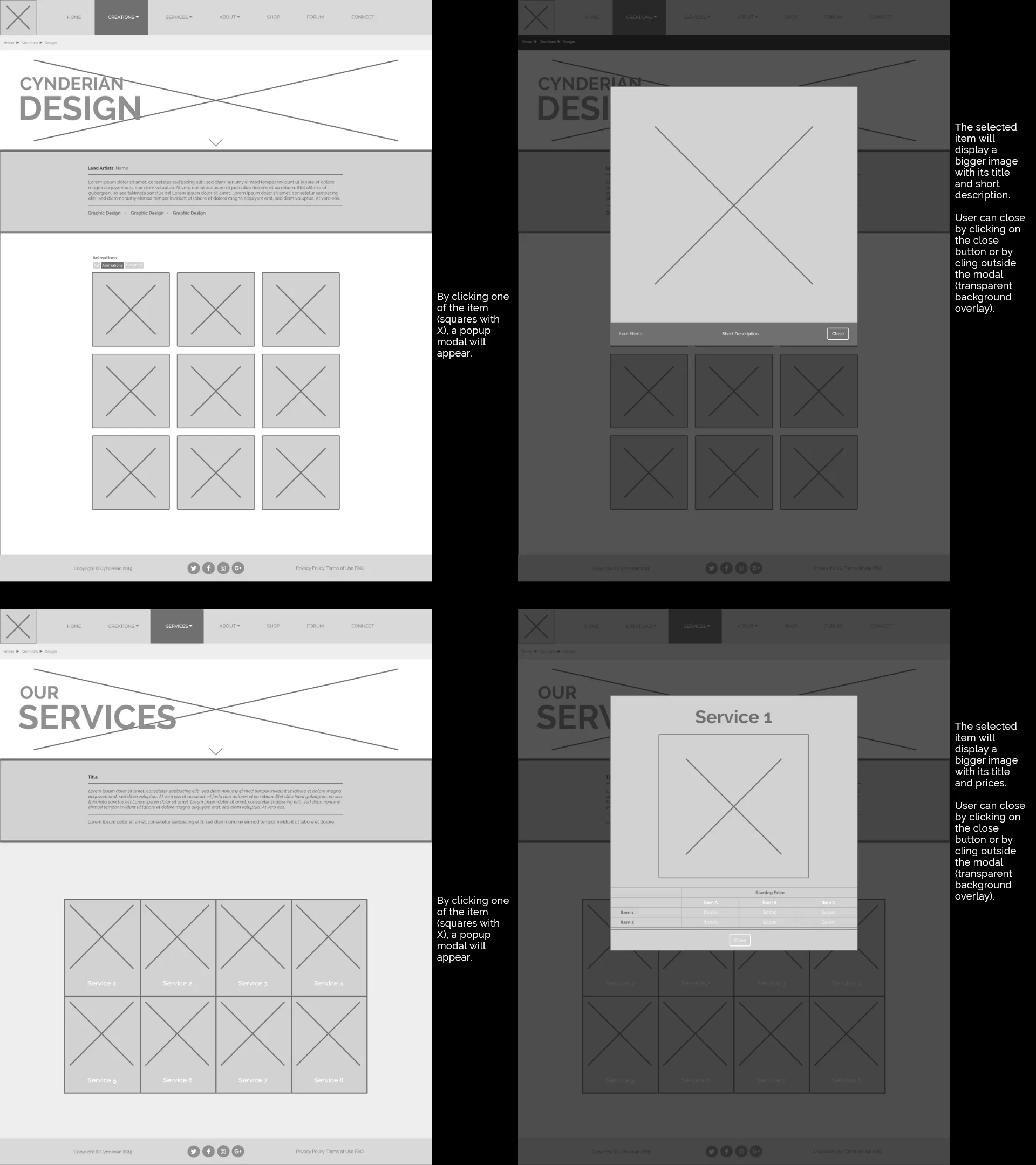
Wireframes 2
Test
Using the wireframes and the graphics made by the team, I created a prototype using HTML, CSS, and Javascript with bootstrap framework and launch it on a web hoster. I sent the link to 5 people and their comments were:
- Much more pleasing and visible to look at than before (colors, graphics, font, content blocking)
- Liked the full-width blocks
- Liked the modal popup
- Breadcrumb navigation
- Many missing contents (placeholders)
- Some links are broken
- Project Enquiry form too long
The Redesign: BEFORE AND AFTER
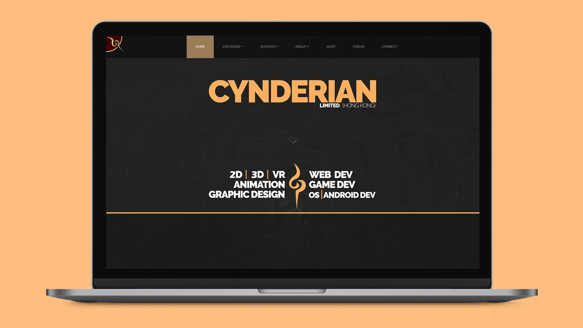
The result of the redesigned between the before and current version is very clear. The current version has an immediate understanding what the site is about from the bold texts highlighting what the company offers.
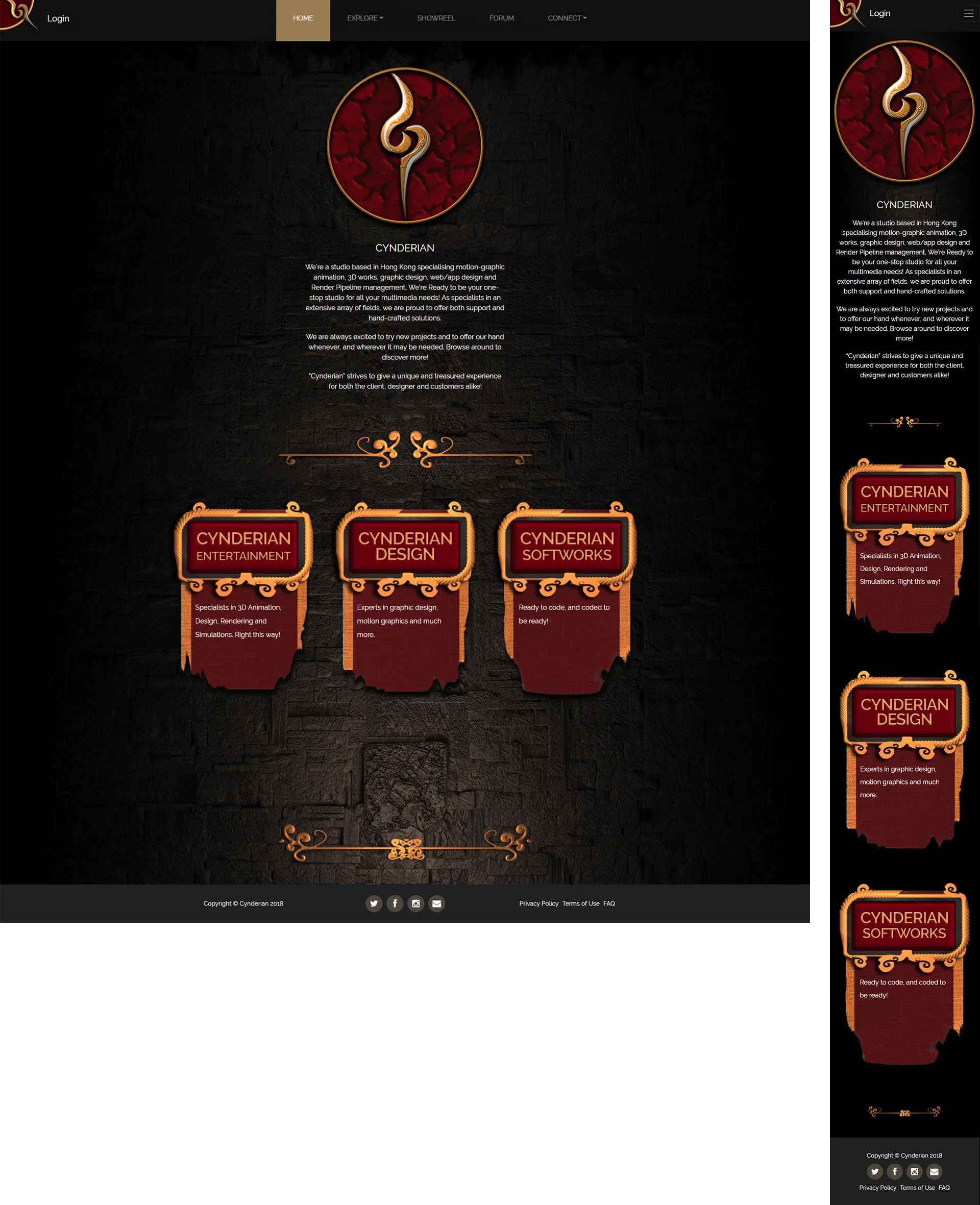
Homepage (Old)
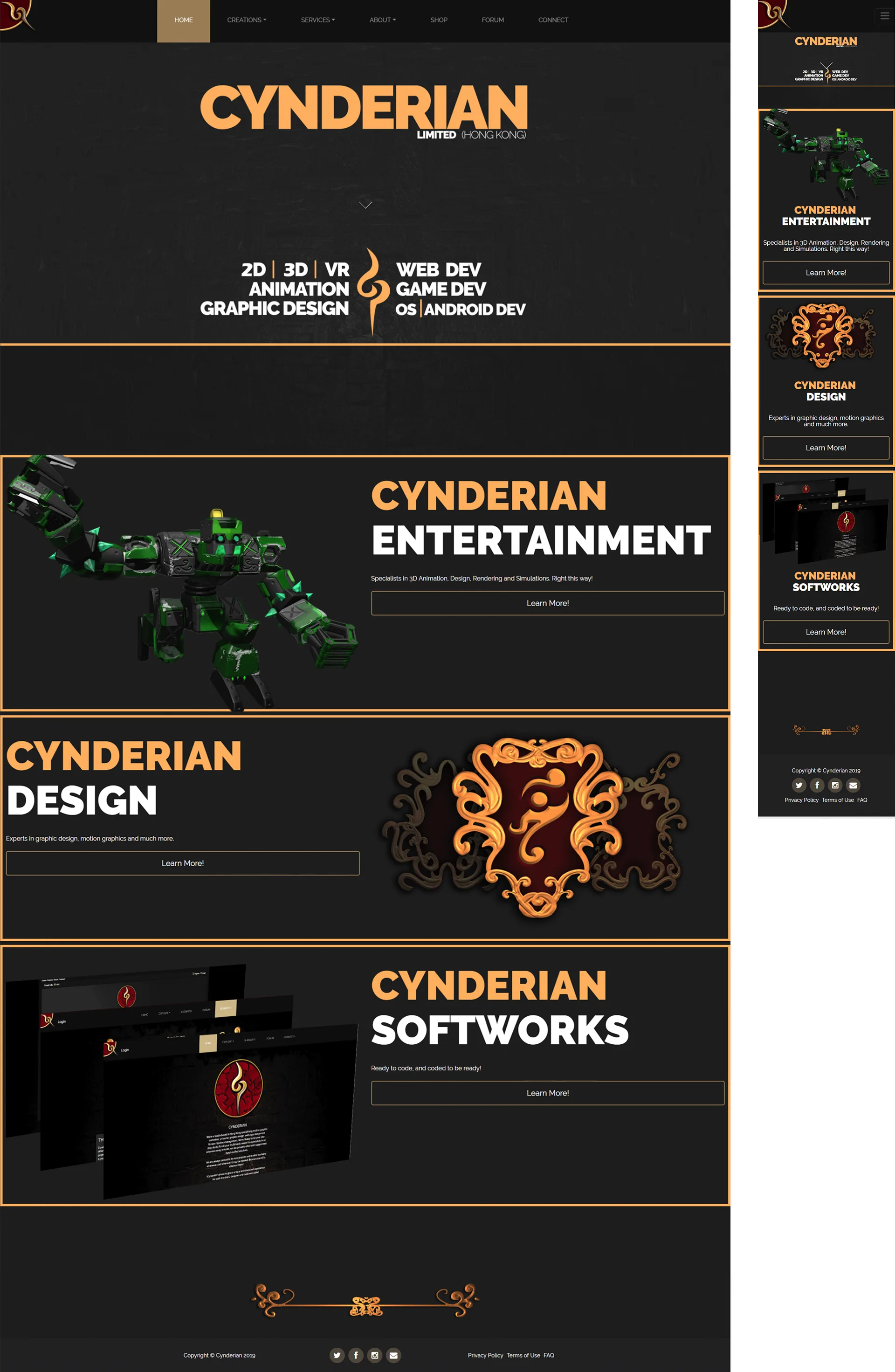
Homepage (New)
I merged the two forms (general enquiry and project enquiry) in one page with buttons to toggle between them when selected. This was another part of the website that is to reduce the user's journey by a click away.
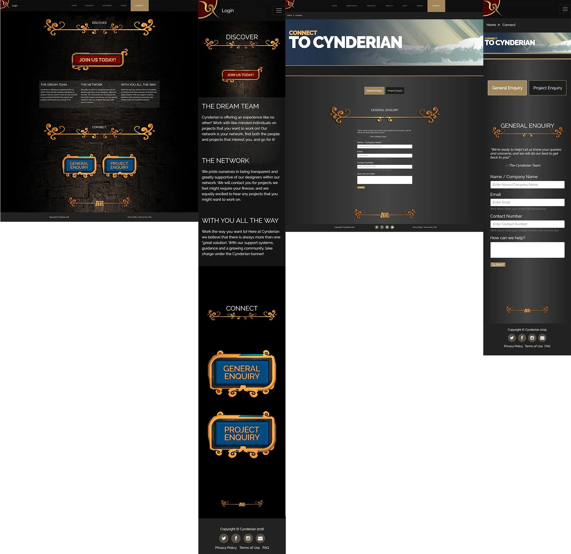
Connect Page (Old & New)
OTHER PAGES
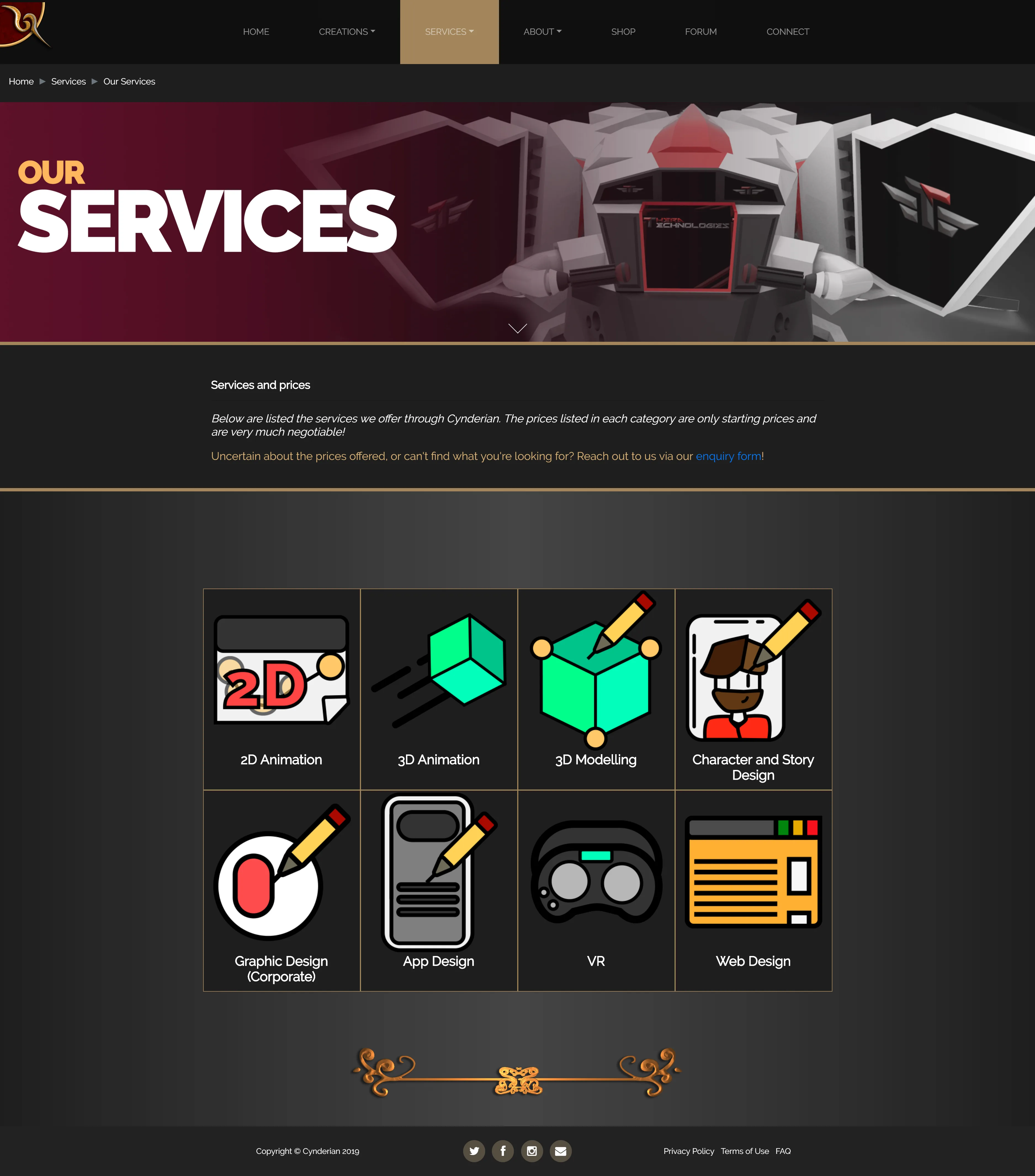
Services Page (New)
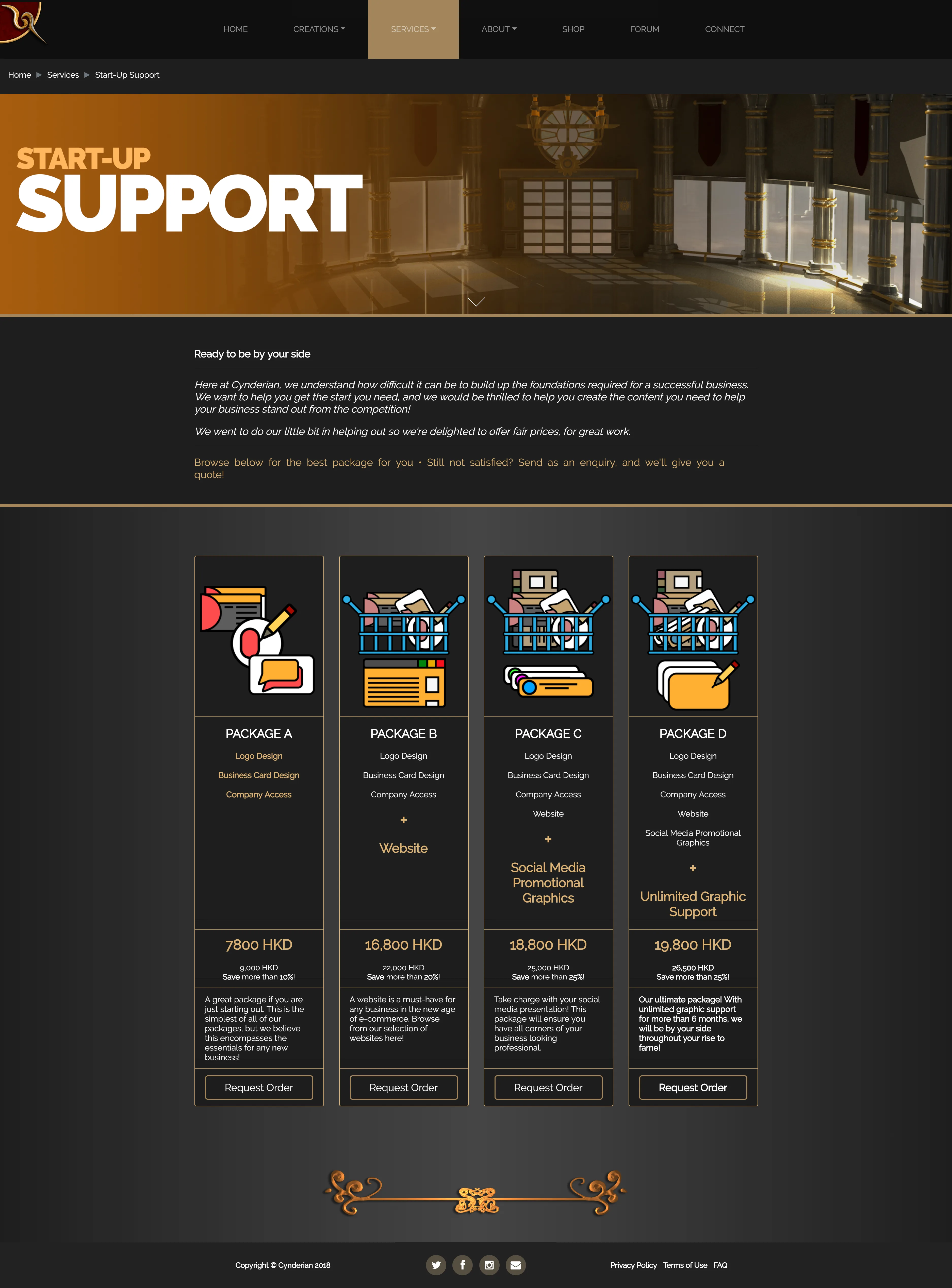
Support Page (New)
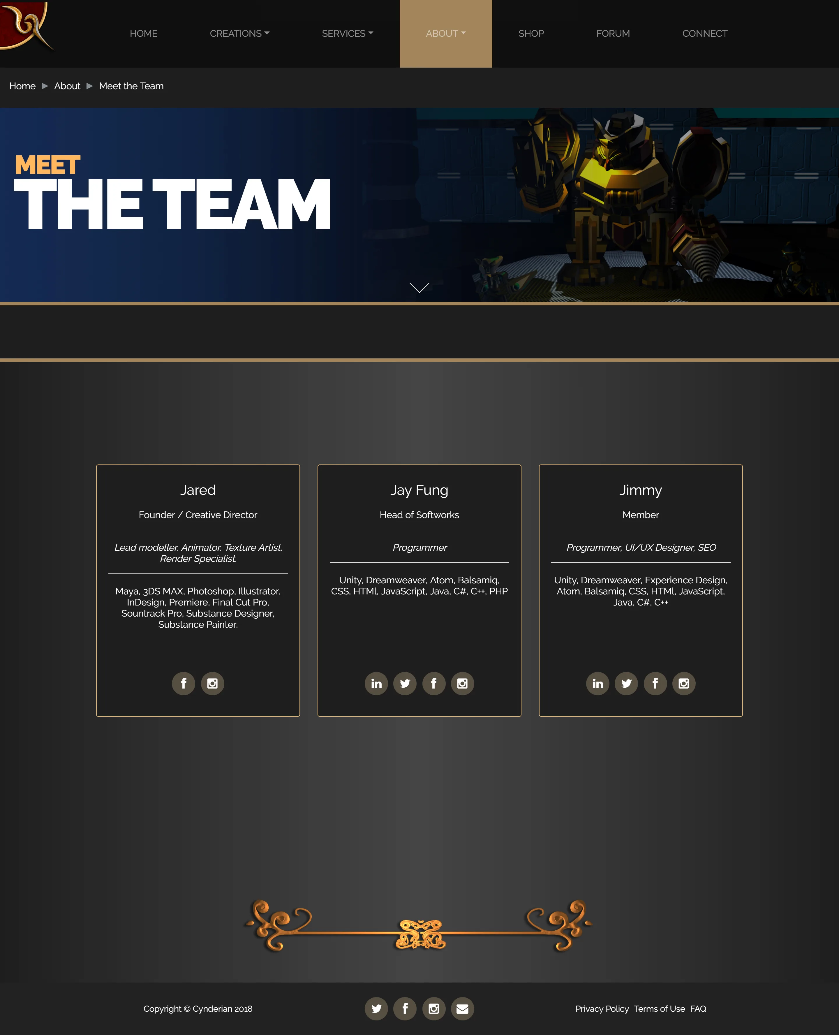
Team Page (New)
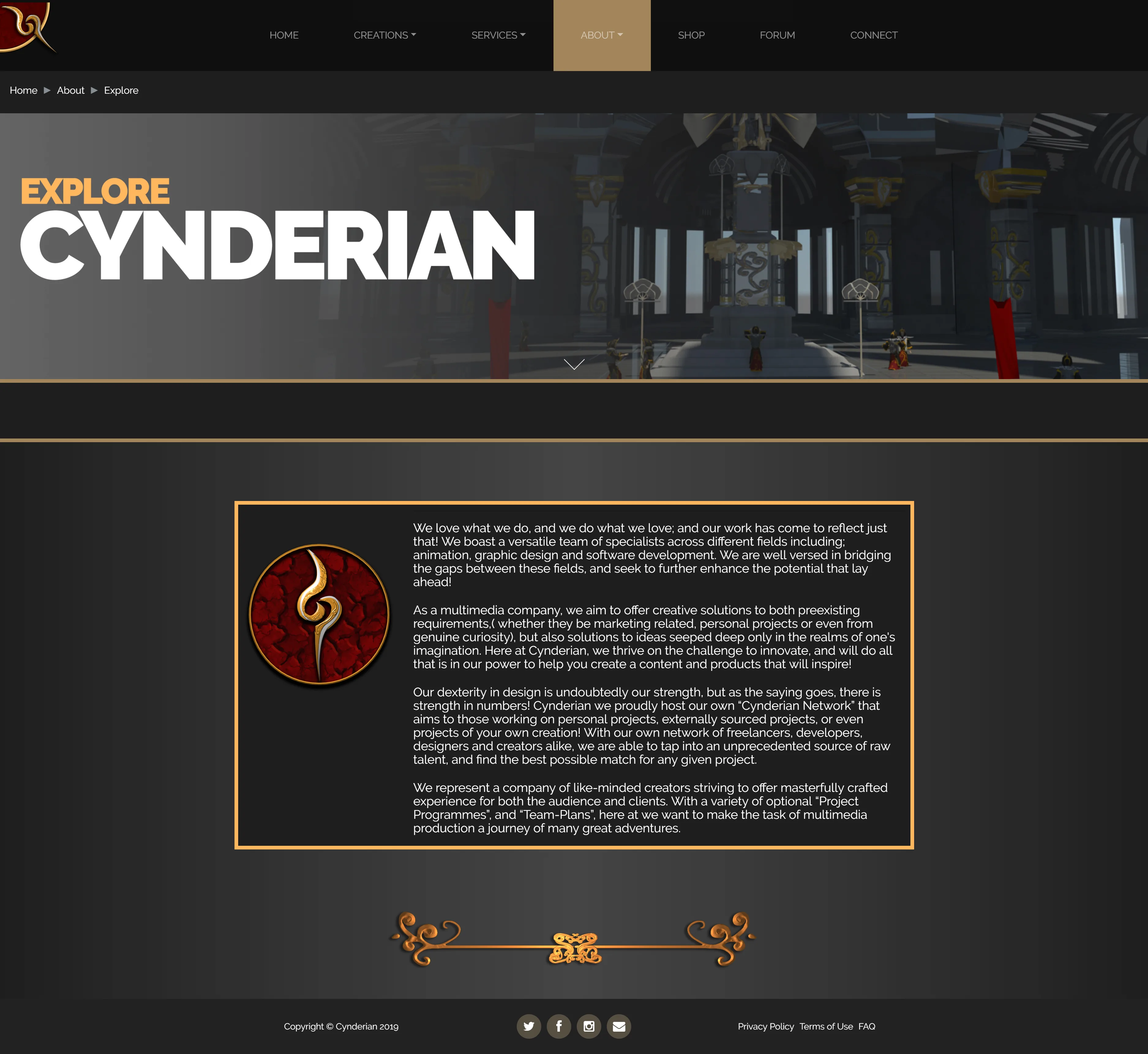
Explore Page (New)
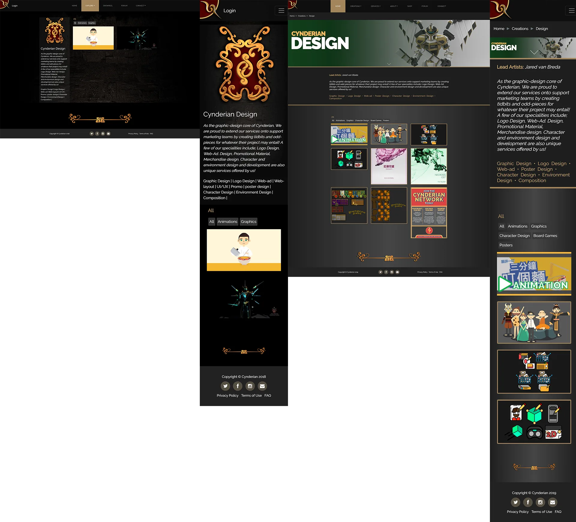
Design Page (Old & New)
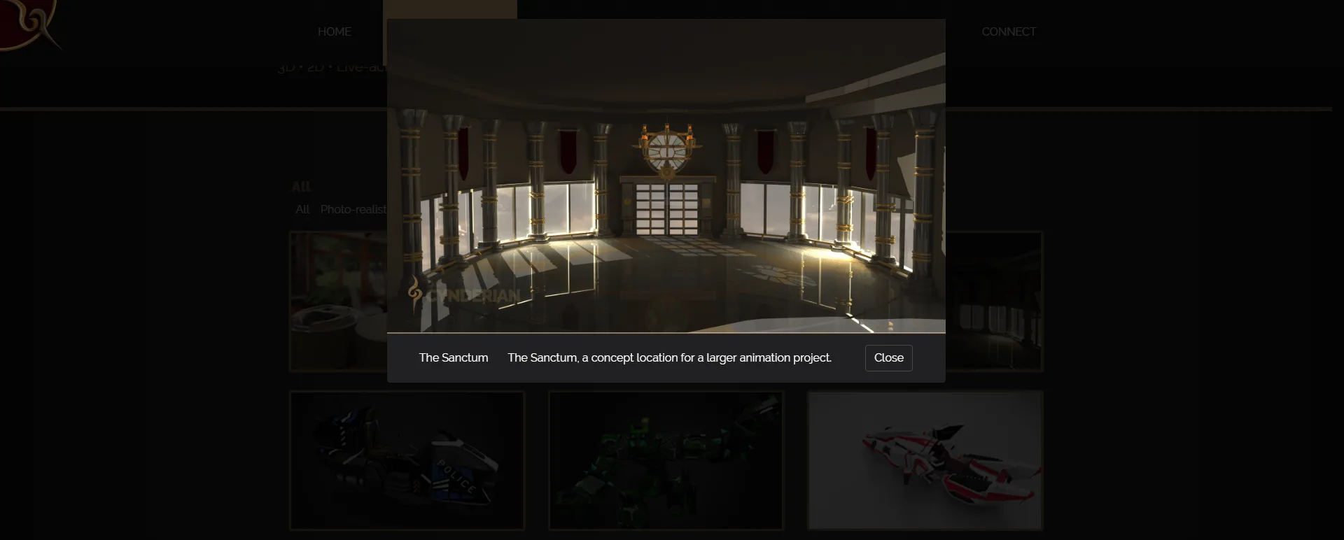
Popup Modal (New)
Results and Takeaways
I was afraid of redesigning it at first but having people involved made me confident. Based on the many iterations and feedback, we can say we have satisfactorily solved the issues we had in unnecessary long user journey, first impression of the company, graphics and colors.